December 20, 2011

Sonification: Now Hear This


Sonification is visualization's poor cousin, probably because vision is a more dominant sense than hearing.  As such I've not come across as many interesting sonification projects as visualization projects.  In my opinion most sonification projects border on the artistic rather than providing deep insight into the data they represent.

Listen up and decide for yourself.

Solarbeat
Solarbeat is a musical orrery.  It's based on the orbit's of the solar system's planets.  Each time a planet completes an orbit a chime sounds.  The inner planets chime rapidly compared with the longer orbits of the outer planets.  The pitch of each planet's chime is higher the longer its orbit is.


Baroque.me
Baroque.me by Alexander Chen explores the first Prelude from Bach's Cello Suites using string lengths to express the pitch of each note (in contrast to classical music notation).  I'm not certain whether this qualifies as sonification or visualization of audio.


Radioactive Orchestra
Radioactive Orchestra consists of 3175 radioactive isotopes.  You can listen to the radioactive decay signature of each.  The fun part comes when you mix (up to) five isotopes to form an audio loop.  You can tweak the volume, pitch, tempo and waveform of each isotope's signature to produce some radioactive beats. 

Mix your own or listen to the clip created by DJ Axel Boman (below).


1945-1998
Artist Isao Hashimoto created a video and audio clip to represent the 2053 nuclear weapons detonated during the period from 1945 to 1998.  Each month lasts one second.  For each nuclear explosion a sound is heard and a marker is displayed briefly on the map at the location of the event.  The colour of the marker and the pitch of the sound signify the country of origin of the nuclear weapon.  A running tally of the countries' detonations is displayed at the top of the clip.  There is also a subtle (at least to me) stereo effect; the left/right balance of the sound corresponds to the east/west location of the explosion.

Unfortunately, there are additional sounds played for each passing month (every second) and year.  These interfere with the main focus of the project.  "Sonic junk" perhaps?


20 Hz
20 Hz was produced using data collected by the CARISMA radio array as it observed the solar wind during a geo-magnetic storm in the Earth's upper atmosphere.  The data was collected at a frequency of 20Hz and interpreted as audio.


If you are aware of any other interesting sonification projects then please leave a comment below.

December 11, 2011

Infinite Jest Visualization

My last blog post reviewed several visualizations of narrative text.  In it I mentioned that I was working on a similar project.  Here is version 1.0 - a visualization of David Foster Wallace's amazing book Infinite Jest.


I created the visualization using D3.js.  It's essentially a scatter plot in which each scene is represented by a dot.  The scenes are arranged along the x-axis in the order they occur in the book, and are chronologically positioned along the y-axis.  You can use the interactive version if you have a "modern" browser, i.e. recent versions of Firefox, Chrome, Opera and Safari.  IE users will have to make do with the images in this post.

The main ideas I was interested in visualizing were what happened, when, and who was present.  The when question is particularly interesting due to Wallace's use of Subsidised Time.  It became clear as I was preparing the data that much of the book is set during the Year of the Depend Adult Undergarment, but I pressed on with the visualization anyway.

Mouse-over a scene's dot and a summary of the scene is displayed below the chart.  Names of the characters present in the scene are highlighted in the legend to the right of the chart.  You can also mouse-over a character's name in the legend, which will highlight those scenes in which the character makes an appearance.

Not all scenes can be pinned down to a particular date; for some only the year is known (in such cases the scene's dot is positioned at the start of the year).  Some scenes have no obvious date so they're located at the bottom of the chart; the unspecified year.

Highlighting particular characters you can sometimes pick out narrative threads, for example the conversation that takes place between Remy Marathe and Hugh/Helen Steeply on the outcropping overlooking Tucson, Arizona.


I'd also like to be able to visualize references to characters.  James ("The Mad/Sad Stork") Incandenza is referred to often but is present in only a few scenes.  So too the final scenes where Don Gately is in hospital refer to characters (and events) earlier in Don's life but those characters, e.g. Gene Fackelman and Whitey Sorkin, aren't present in the hospital scenes, and so don't appear in this visualization.  Something for version 2.0 perhaps.

I'm indebted to Dr. Keith O'Neill who kindly permitted me to use his invaluable Infinite Jest Scene-by-Scene Guide, which forms the basis of the data used in the visualization.  I also relied heavily on The Infinite Jest Wiki.

The visualization is shared using a Creative Commons license, and the source-code is available on GitHub.

November 21, 2011

Text Visualization

I'm currently working on a visualization of the text of one of my favourite books; hopefully I'll have something to show you in a few weeks.  In the meantime I thought I'd review other visualizations of narrative text. 

Stefanie Posavec
Stef Posavec is a graphic designer who has created several beautiful and engaging visualizations of texts.  Interestingly, Stefanie creates many of her visualizations by hand rather than writing code to generate them.

Literary Organism is a tree diagram of the structure of part one of Jack Kerouac's On the Road.  The tree's hierarchy represents chapters, paragraphs, sentences and words, colour-coded according to theme.


Stef used a similar model to visualize six editions of Charles Darwin's On the Origin of Species.  Here colour is used to denote whether a sentence survived from one edition to the next.


More of Stef's work is showcased in the profile video shown below.

Ben Fry
Speaking of Darwin's On the Origin of Species, Ben Fry also designed a visualization of the book's "evolution".  Fry's visualization shows the "preservation of favoured traces", by colouring passages in the text according to the edition in which they were first introduced and animating the results.


Stephan Thiel
Stephan Thiel's Understanding Shakespeare project takes several approaches to visualizing different aspects of the works of Shakespeare.

Below, dramatic structure is visualized by showing an overview of the entire play.  Each scene is represented by a block that is scaled according to its length.  Characters are ordered from left-to-right according to when they first appear in the play with the major character's speeches being highlighted.


The next example shows summaries of each play.  They were constructed by choosing the most representative passage from each speech as determined by the frequency of the words it contains.


The visualizations below were created by grouping together each character's statements that begin with a personal pronoun (I, you, he, she, them ...); the aim being to discover the character's role within the play.


This visualization shows only the stage directions found in A Midsummer Night's Dream


The final set of visualizations attempts to identify famous quotes within each play.  Selected quotes are scaled according to the number of hits returned when searching for them on Google.


Many Eyes
I've blogged about IBM's social visualization platform, Many Eyes, previously.  It provides several text visualization tools, and many users have applied these to various famous texts.  Below are three visualizations I created for Harper Lee's To Kill a Mockingbird. Click on a visualization to interact with it.

The first is an example of the ubiquitous Word Cloud.


Below is a Word Tree for all sentences starting with the word "Boo". Each branch of the tree groups together sentences that start with the same words (from higher levels of the tree), with words scaled according to their frequency.


The last example is a Phrase Network that visualizes all three-word phrases that match "____ to ____".

In my search for visualizations of famous texts I inevitably came across visualizations of The Bible. In fact, there were so many that I'll review them in a future post.

November 16, 2011

Out of Office: Using the Internet for Greater Freedom in Your Work Life


No, VisLives! hasn't been hijacked by spammers.  Rather, this blog entry is about another project I've been working on that is tangentially related to my visualization work.

You see, when I work on visualization, I'm also telecommuting.  Now, my friend Gihan Perera, is also a telecommuter - a Digital Nomad, in fact - so we decided to write a book together sharing our telecommuting knowledge and experience.  And it's just been published!


The book is called "Out of Office", and is ideal for you if you like your job or your business, but you’d like to use the Internet to get more convenience, comfort and freedom in where and when you work.  The book will help you move “out of office”, part-time or full-time, without you being out of sight and out of mind.

Find out more and get the book here.

Special Offer: Readers of VisLives! can get a 20% discount off the price of "Out of Office" by entering the word freedom in the password box on the Out of Office book's Web site.

November 7, 2011

A Visualization Hippocratic Oath

Jason Moore of the US Air Force Research Laboratory, has proposed a Hippocratic Oath for Visualization:
I shall not use visualization to intentionally hide or confuse the truth which it is intended to portray. I will respect the great power visualization has in garnering wisdom and misleading the uninformed. I accept this responsibility wilfully and without reservation, and promise to defend this oath against all enemies, both domestic and foreign.
Reading this reminded me of Manuel Lima's Information Visualization Manifesto, here's a brief summary:
  • Form follows function
  • Start with a question
  • Interactivity is key
  • The power of narrative
  • Do not glorify aesthetics
  • Look for relevancy
  • Embrace time
  • Aspire for knowledge
  • Avoid gratuitous visualizations
I like both Moore's Oath and Lima's Manifesto.  The Oath has elements of the paraphrasing of the Hippocratic Oath for physicians: First, do no harm, which underpins the guidance provided by the Manifesto.

What do you think?

Via EagerEyes.

October 31, 2011

xkcd visualizations

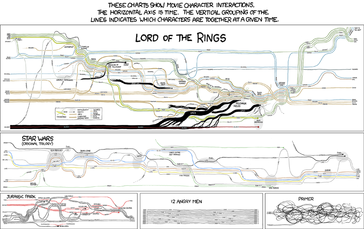
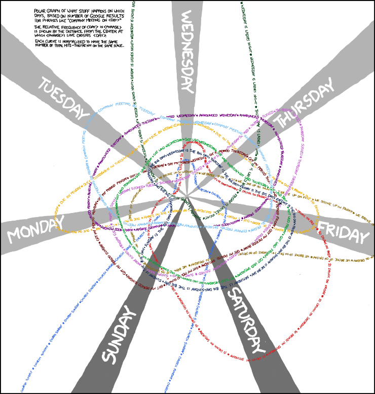
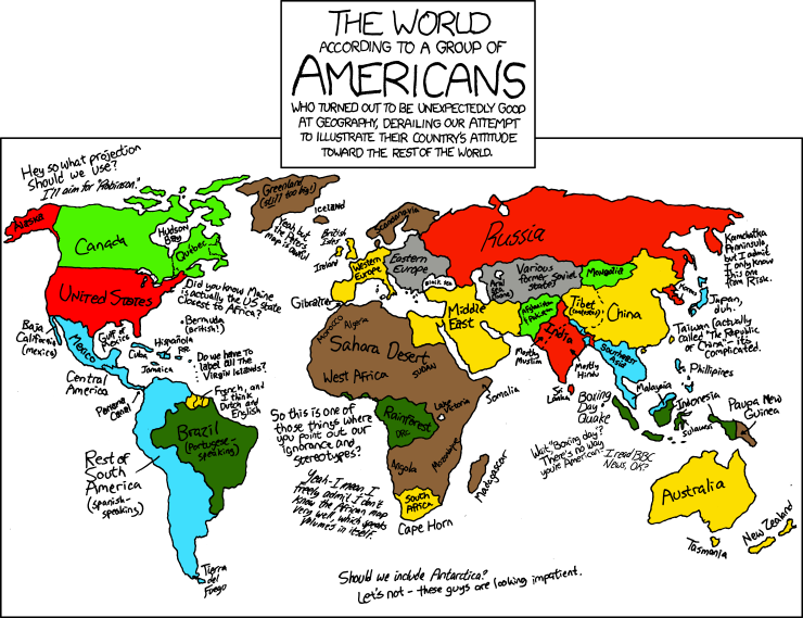
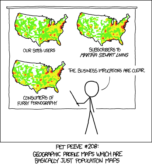
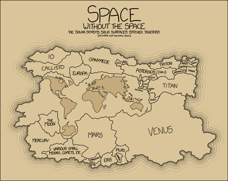
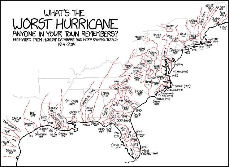
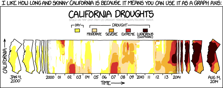
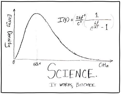
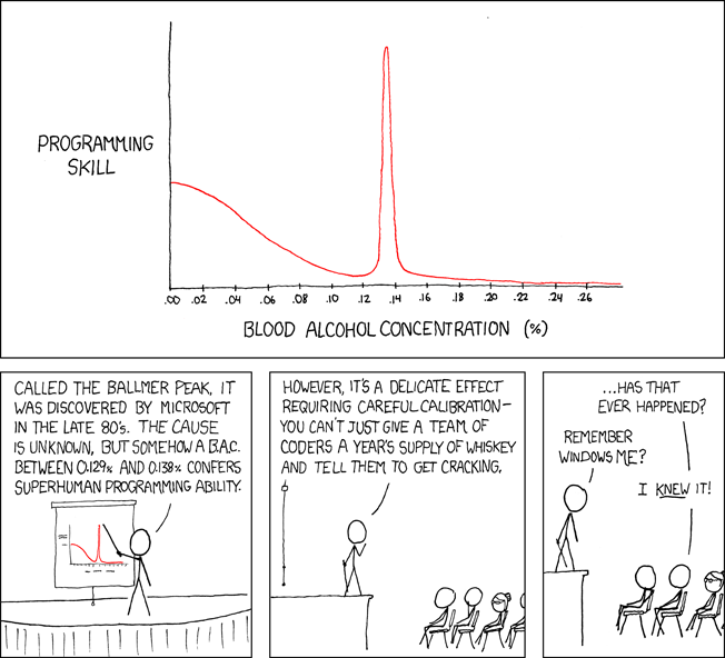
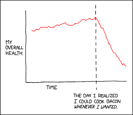
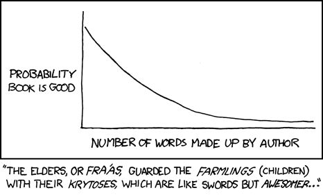
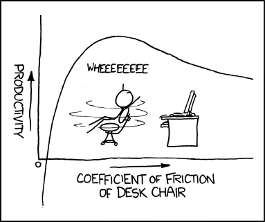
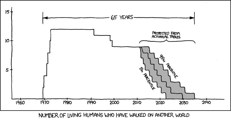
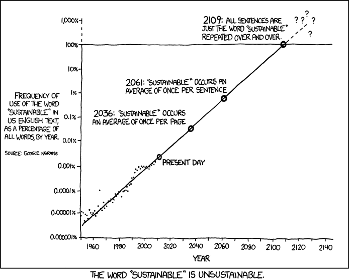
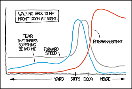
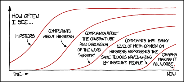
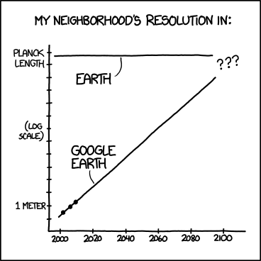
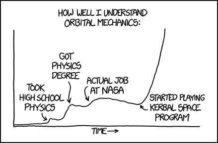
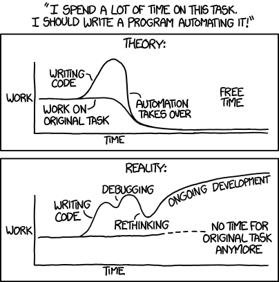
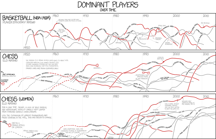
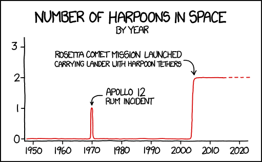
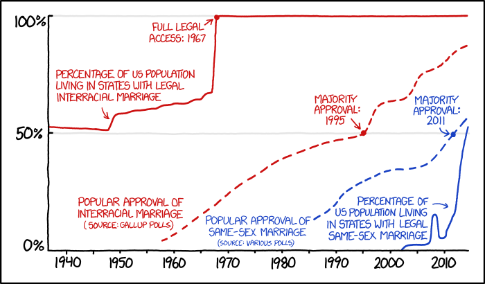
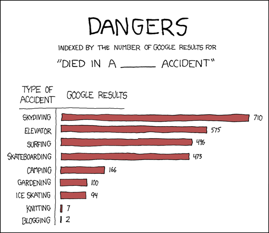
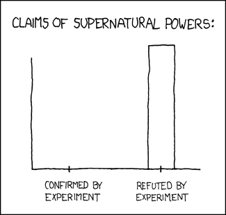
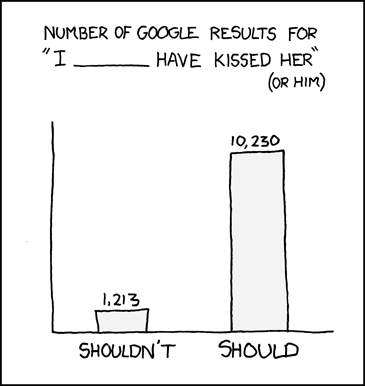
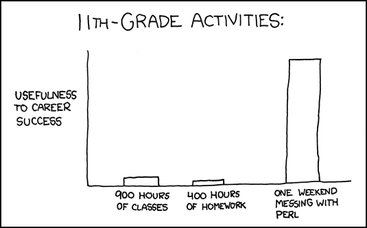
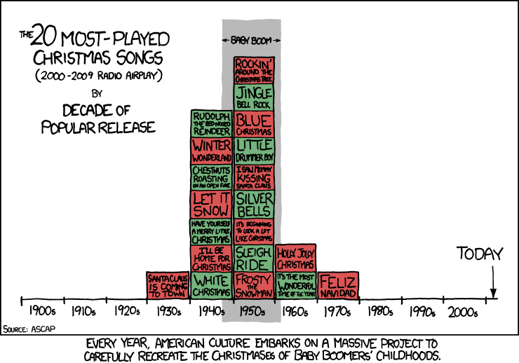
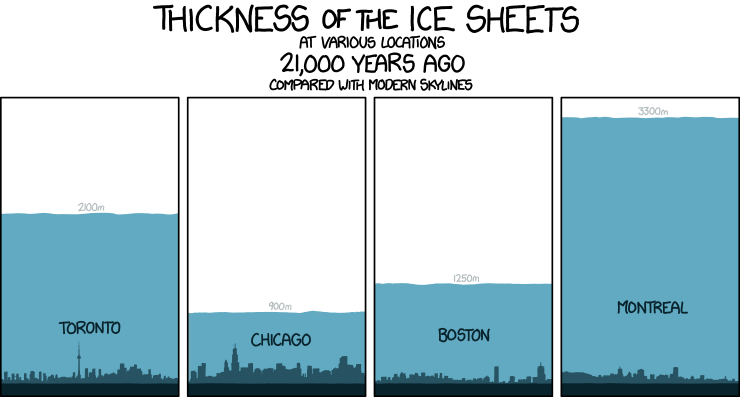
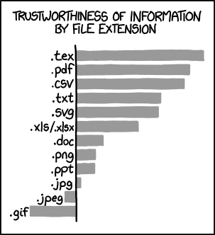
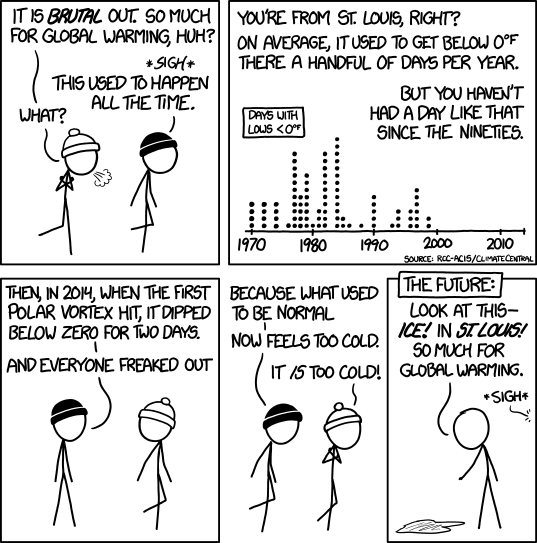
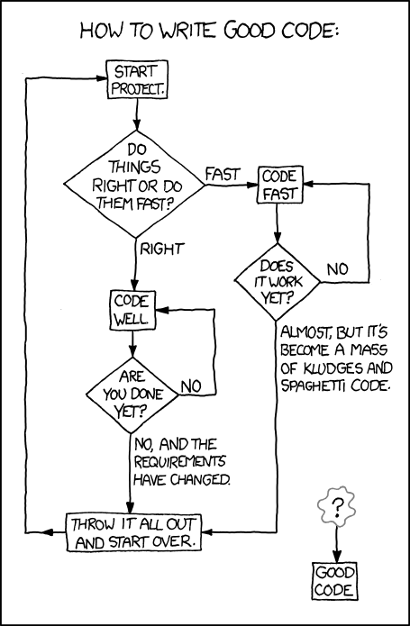
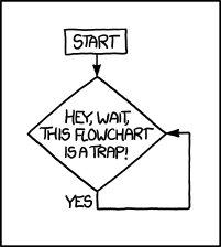
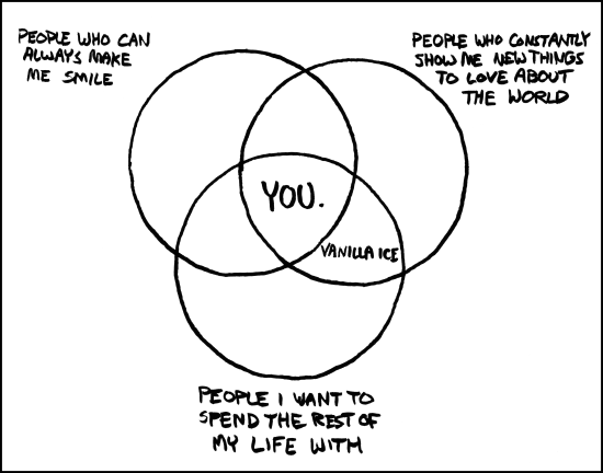
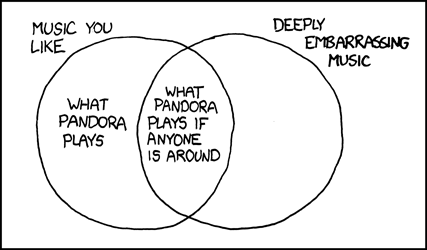
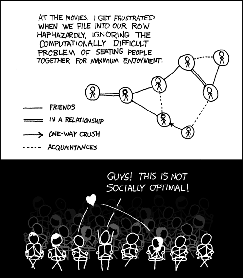
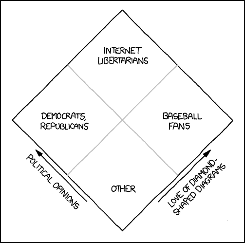
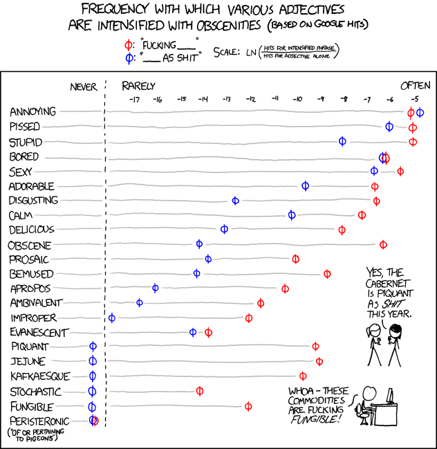
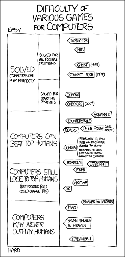
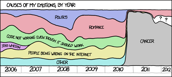
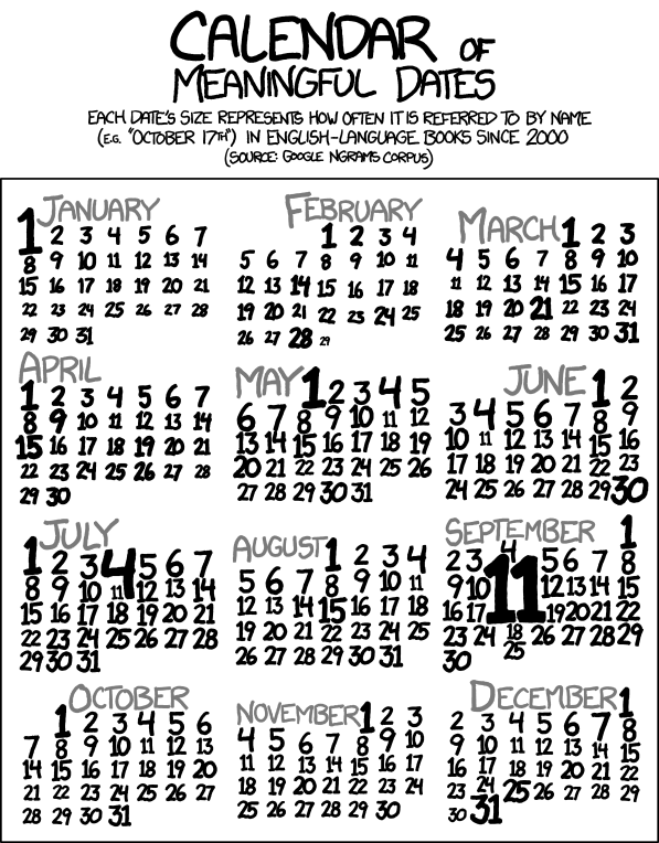
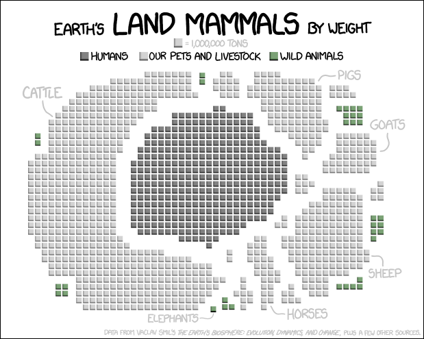
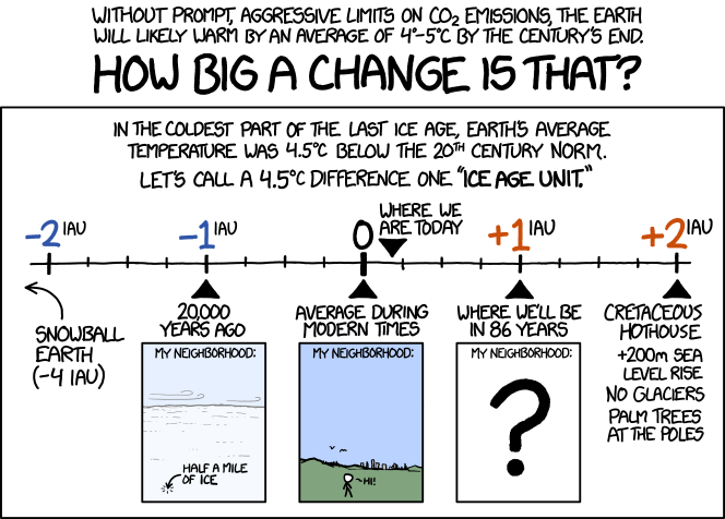
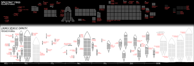
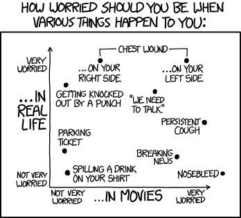
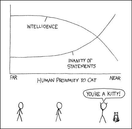
I'm a big fan of Randall Munroe’s web comic xkcd.  I find its nerdy humour particularly amusing.  Randall often employs visualization in xkcd, so I've combed through the xkcd archives and picked out some of my favourite examples.

Movie Narrative Charts


Days of the Week

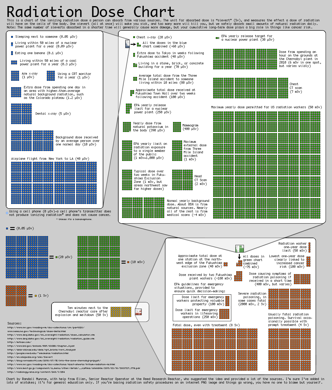
Radiation Dose Chart
I've blogged about this one previously.  Following the Japanese earthquake and tsunami in March 2011, Monroe published the following chart to provide some perspective on radiation doses.


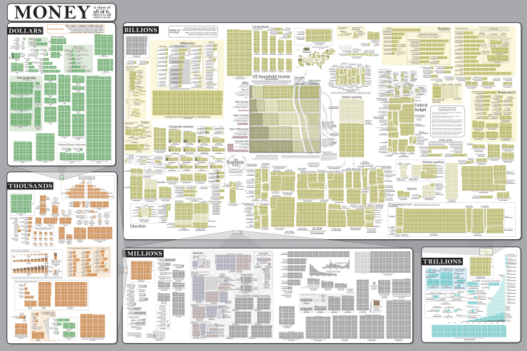
Money
And in a similar vein is this epic graphic...


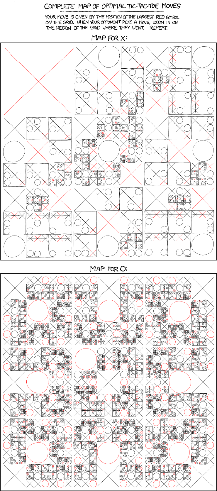
Tic-Tac-Toe

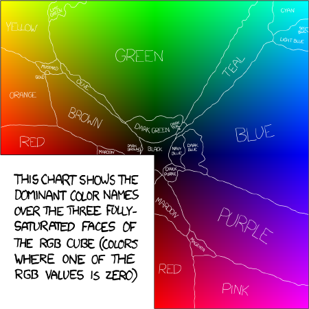
Colour
Randall conducted a survey of 222,550 users (sessions) for the names they ascribed to over five million colours.  From a subset of the results he built the map below showing the most popular names for the fully-saturated colours.


Self-Description
Three clever self-referential charts.


Some rare examples of good infographics:

Height


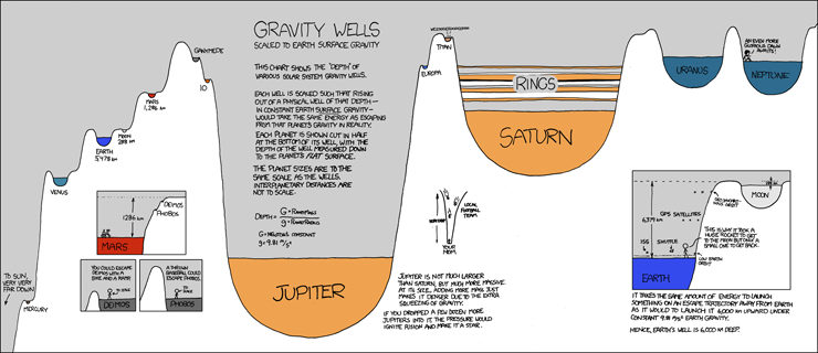
Gravity Wells


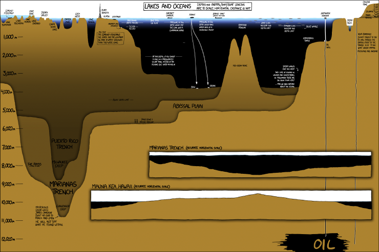
Lakes and Oceans


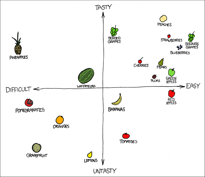
Fuck Grapefruit
The outlier that is grapefruit.


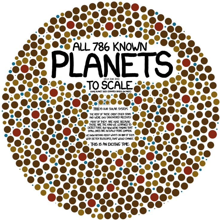
Exoplanets

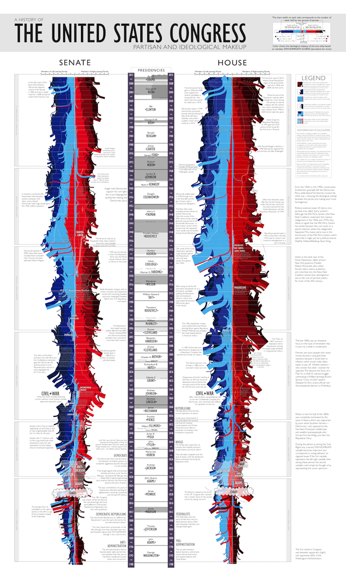
Congress

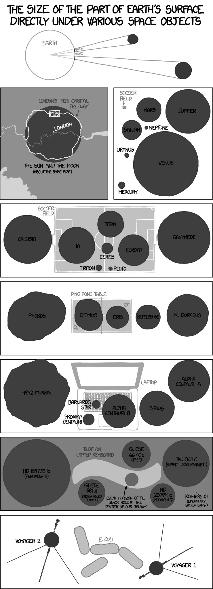
Angular Size

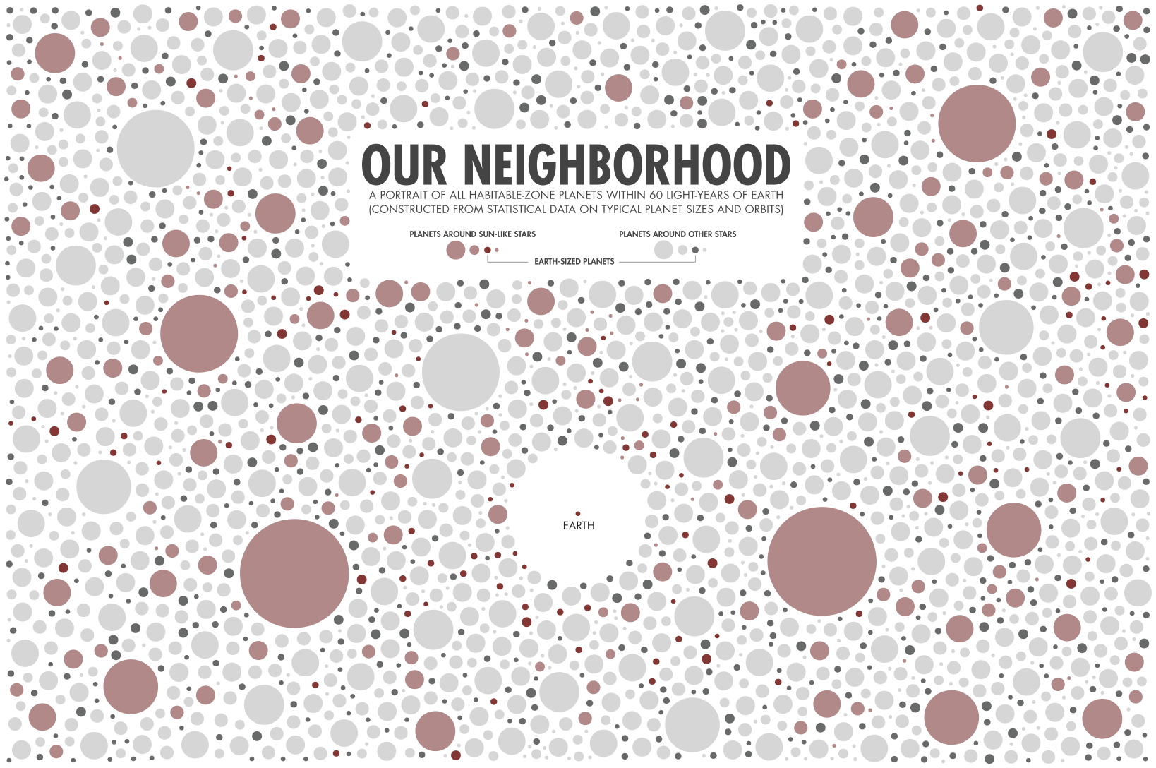
Our Neighbourhood

Tall Infographics

The remaining examples I've simply grouped by type.

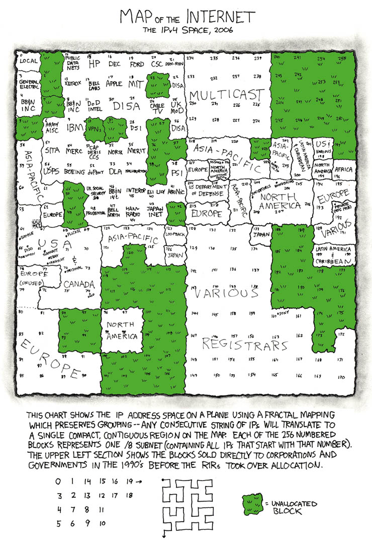
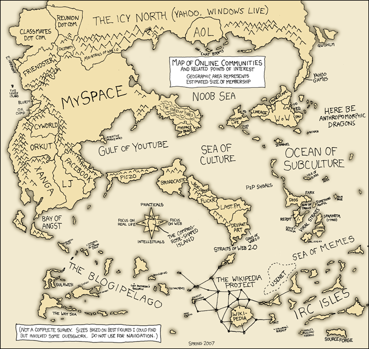
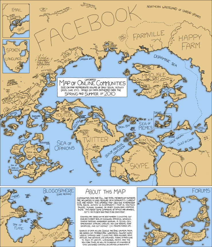
Maps


Line Charts


Bar Charts


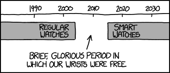
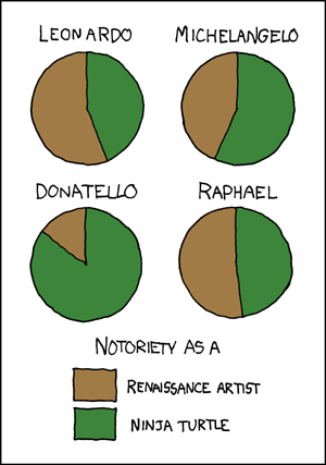
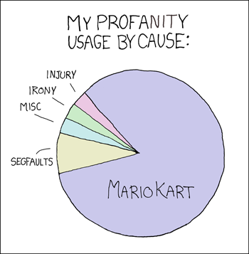
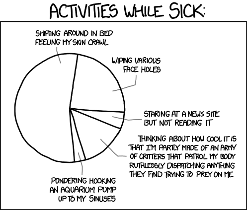
Pie Charts


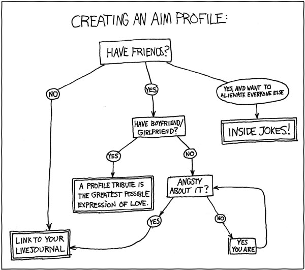
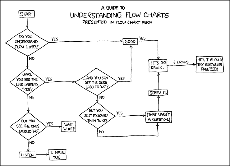
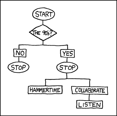
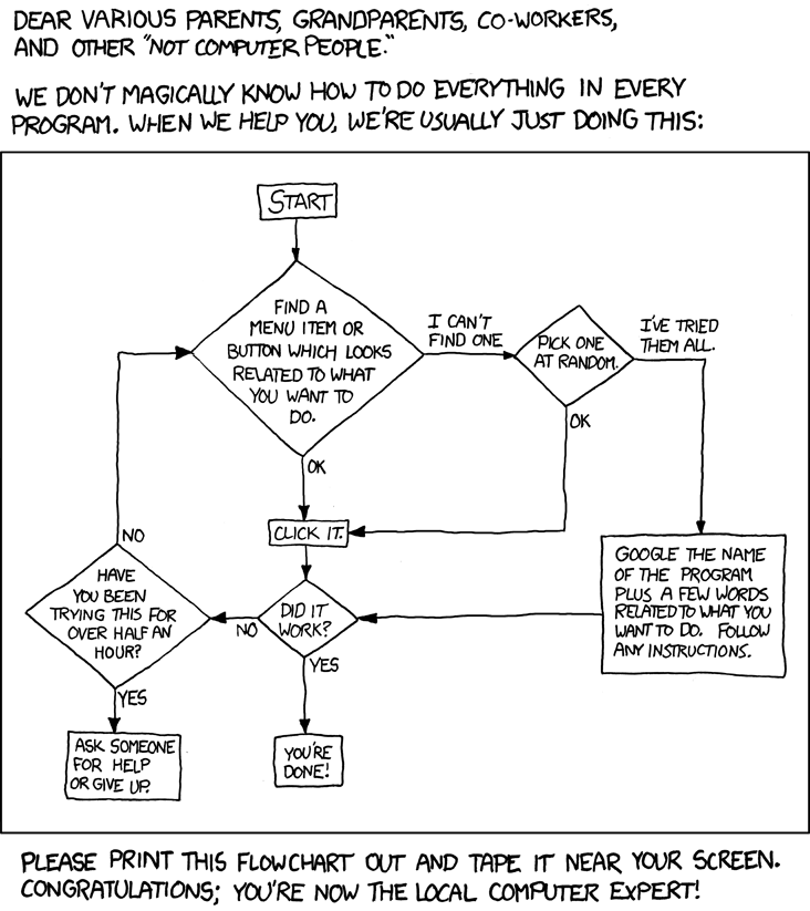
Flow Charts


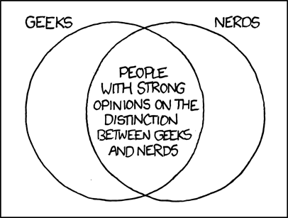
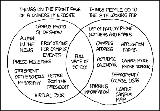
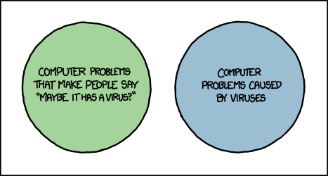
Venn Diagrams


Miscellaneous


Please leave a comment if I've missed any.