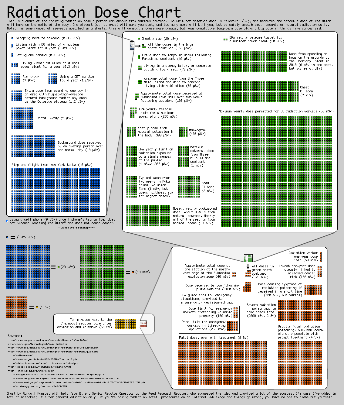
1. Randall Munroe, best known for his xkcd webcomic, published a Radiation Dose Chart.

2. Alexandra, a user at Visualizing.org posted her Nuclear Radiation infographic.

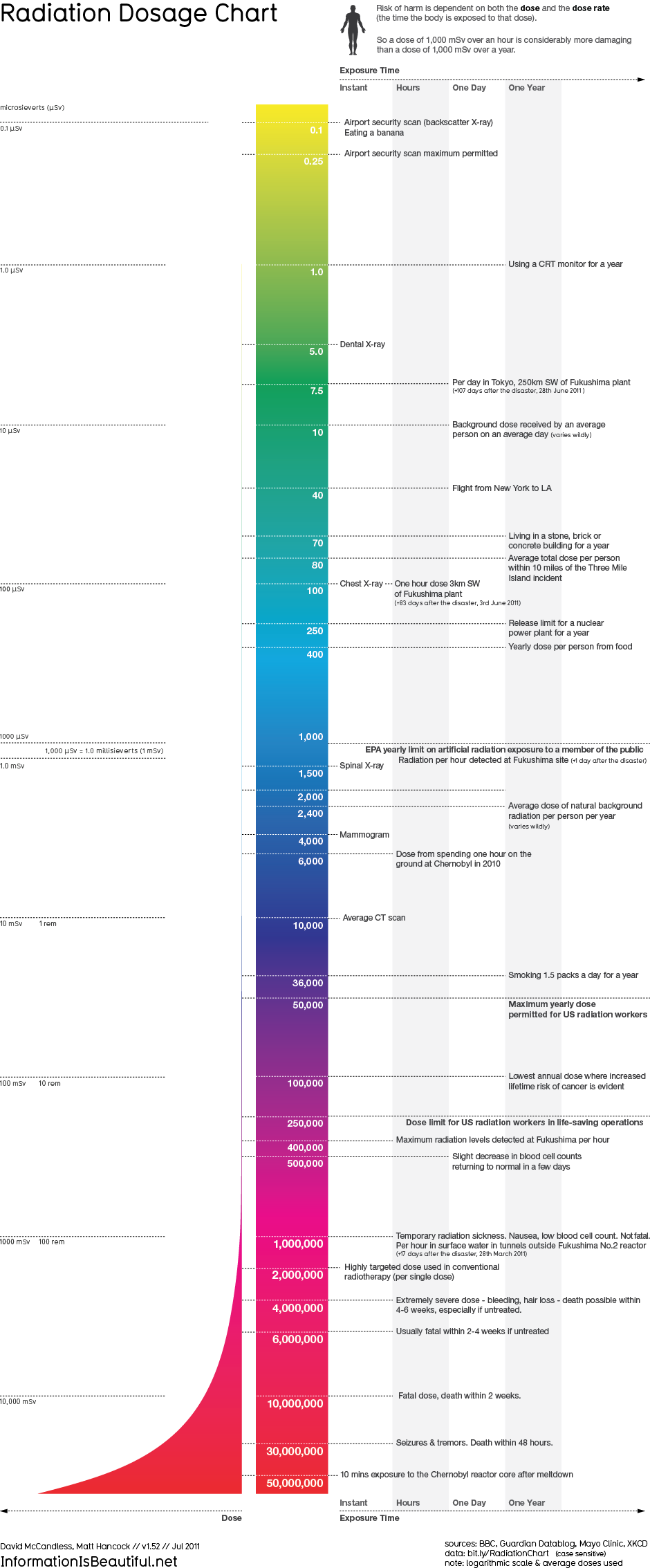
3. David McCandless of Information is Beautiful published his Radiation Dosage Chart.

They're all quite useful, demonstrating the enormous range of measurable radiation levels from that to which we're exposed in daily life up to the lethal doses. However, I think Alexandra's infographic is most useful as it also visualizes dose rate. This additional dimension does make Alexandra's chart a little more difficult to comprehend but it's worth the effort.
What do you think?
If you know of any other radiation dose charts then please let me know.