May 31, 2011

Data Wrangler & Google Refine


The productive folks over at the Stanford Visualization Group (also responsible for the wonderful Protovis toolkit) have released a new on-line tool called Data Wrangler:
Wrangler is an interactive tool for data cleaning and transformation.
Spend less time formatting and more time analyzing your data.

The video clip above shows Data Wrangler in action.

The tool is in alpha but looks very promising.

Google offer a similar tool, Google Refine, which takes a different approach to the problem of data preparation - see the video clip below for example.


So, we're spoiled for choice when it comes to free, high quality tools for preparing data for visualization.  Next time you have a data set that needs scrubbing before presentation give Data Wrangler or Google Refine a go...

May 19, 2011

Number Picture: A New Kind of Social Visualization Tool


Number Picture is a new web-site whose aim is to provide a tool to enable people to visualize their data.  In this regard it is similar to previous social visualization efforts such as IBM's Many Eyes, Tableau Public and the (now defunct) Swivel.  Where Number Picture differs considerably from these other tools is that the crowd-sourcing emphasis is on the visualization designs rather than the data - that is, users of the site are encouraged to contribute new visualization designs, called templates, with which to visualize data.

Currently, there are more than 30 templates.  Hopefully, this number will grow as designers contribute new templates to the site.  Templates are written using the Processing.js toolkit.  Instructions are provided to get you started.

Above is shown a visualization I created using Number Picture with data sourced from ONE The Data Report 2011.  The same data visualized using a different template is shown below.

May 16, 2011

Great Linux World Map


As a visualization and Linux enthusiast I couldn't resist drawing attention to The Great Linux World Map published on the Dedoimedo blog.  All the main distros are represented with lots of Linux puns and in-jokes.

It reminded me of the maps of Online Communities Randall Munroe has published over the years on his XKCD web comic.  Just as Munroe has had to update his maps as the Internet landscape has evolved so too we can look forward to future renditions of the Linux World Map in keeping with the tectonic changes afoot.

May 5, 2011

Osama bin Laden's Death: Mixed Emotions

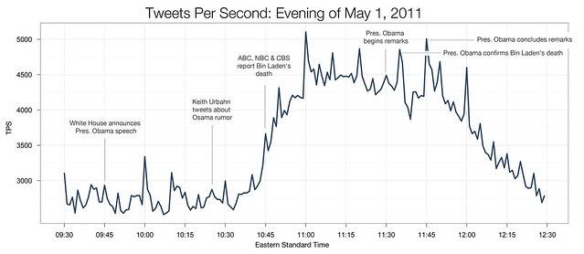
Tweets per second.

Upon news of Osama bin Laden's death Twitter recorded the highest sustained rate of tweets in its history.  They provided the annotated chart shown above in which the number of tweets per second exceeds 3000 for more than one and a half hours.

In the days that followed the public response has run the full gamut of emotions from wild rejoicing to deep sorrow, and I've found myself wondering what the prevailing mood of the population has been.  The New York Times has attempted to answer this question at least with regard to its readership.  They asked their readers:
Was his death significant in our war against terror? And do you have a negative or positive view of this event?

and 13,864 of them responded by plotting their answers on a graph and leaving a comment.  The graph is shown below; each dot represents a comment.  I couldn't find any information regarding what the colour of each dot represents but I suspect it's the number of respondents who clicked in that spot - the darker the colour the larger the number of clicks.


The chart is interactive allowing you to browse the respondents' comments.  You can see that the positive & significant quadrant received the most responses.  There's also a strong correlation between responses to the two questions (see the x = y cluster).  I can also see clusters of responses that represent strongly held positions: these lie in the corners of the chart and at the extremes of each axis.