Updated Sept. 1, 2011
The web of lawsuits filed for infringement of mobile technology patents grows more tangled with each passing month. Several infographics have been published to try to help make sense of precisely who is suing whom.
1. Nick Bilton published the graphic below in the New York Times summarising the situation as it stood in March 2010. The chart shows the various protagonists involved but some of the links correspond to multiple lawsuits, which isn't represented by this graphic.
2. This was followed in October 2010 by a chart published in The Guardian. It's similar to Nick Bilton's but distinguishes between lawsuits that are in progress vs. concluded. The choice of colours is garish and kind of unnecessary as they don't represent anything. The layout could also be improved to reduce the number of crossed links.
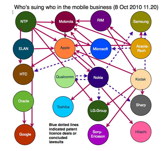
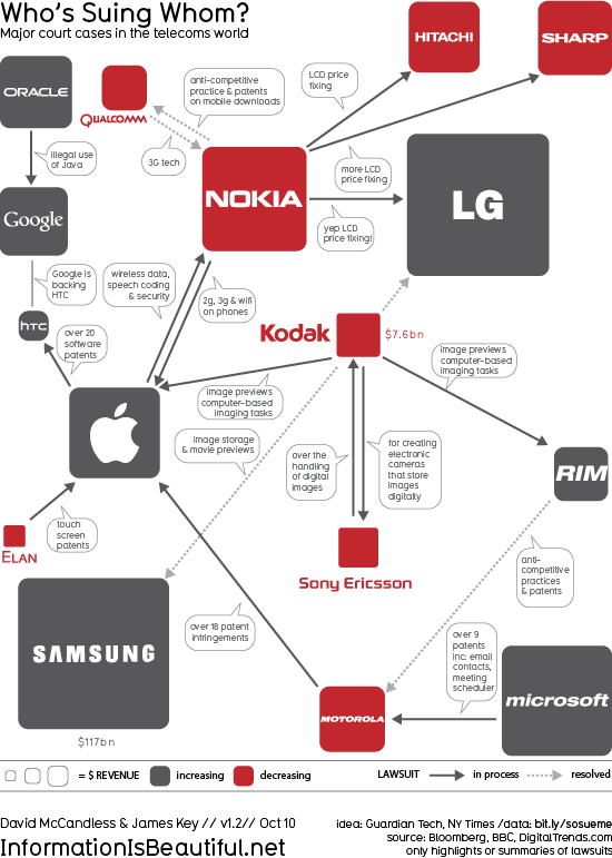
3. Dave McCandless reworked The Guardian's infographic to produce the following infographic for his Information is Beautiful blog. Dave uses company logos which improves recognition of the warring parties, scales them according to their revenues and colours them to represent growing or shrinking incomes. He also annotates the links with information about the lawsuits and their dollar values.
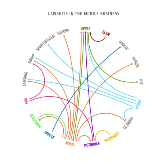
4. Design Language News tried a circular layout to improve clarity.
5. Florian Mueller focussed on the growing number of patent suits ranged against device-makers using the Android operating system.
6. Most recently Harry McCracken published the following "cheat sheet" in Technologizer.
I think Dave McCandless' infographic is the best of the bunch as it manages to present the most information about the mobile patent wars. Harry McCracken's cheat sheet is a good compact representation of the situation - being a symmetric sparse matrix it could probably be compressed even further.
Update 22 August, 2011
Reuters published this infographic explaining the state of the mobile patents landscape just prior to Google's acquisition of Motorola:
It's not bad but Mike Bostock was appalled and responded with his own effort implemented in D3.js (click the image for an interactive version):
Update Sept. 1, 2011
I just spotted another infographic on the mobile patents quagmire. It was published on Geek.com and is credited to Verizon but I haven't been able to find the original.
Geek.com contrast it with the Reuters chart shown above. It lays things out more clearly and adds more detail.
What's your opinion? Please leave a comment below.
If you spot any more such charts then please bring them to my attention.
August 31, 2011
International Science and Engineering Visualization Challenge
Updated Sept. 1, 2011
The National Science Foundation and Science magazine are calling for participation in the annual International Science and Engineering Visualization Challenge. Submissions are sought for five categories:
The video clip above highlights the inspiring winning entries from previous years' rounds of the competition.
For more information please visit the competition's web-site.
Update (Sept. 1, 2011) Congratulations to the winners.
The National Science Foundation and Science magazine are calling for participation in the annual International Science and Engineering Visualization Challenge. Submissions are sought for five categories:
- Photography
- Illustrations
- Informational Posters and Graphics
- Interactives Games
- Videos
The video clip above highlights the inspiring winning entries from previous years' rounds of the competition.
For more information please visit the competition's web-site.
Update (Sept. 1, 2011) Congratulations to the winners.
August 25, 2011
Top-20 Worst Passwords
In December 2009 RockYou.com a social media company experienced a data breach that exposed details of 32 million user accounts. RockYou.com stored users' passwords in plain text!
The stolen passwords were published (with no other identifying information) on a blog. These were used by security company Impreva in a white paper analyzing the strength of the passwords. The white paper lists the top-20 weakest passwords and the frequency with which they were used.
I've been planning to use IBM's social visualization Web site Many Eyes for some time, and the RockYou passwords data is my first foray. I extracted the passwords from the Impreva white paper and created this data set on Many Eyes.
I then created two visualizations using the data set. The first is a simple histogram:
and the second is a word cloud:
What insights do the visualizations offer?
These simple visualizations are useful for providing quick insights into what is fairly simple data.
I found Many Eyes easy to use and am looking forward to seeing what else is possible with it.
The stolen passwords were published (with no other identifying information) on a blog. These were used by security company Impreva in a white paper analyzing the strength of the passwords. The white paper lists the top-20 weakest passwords and the frequency with which they were used.
I've been planning to use IBM's social visualization Web site Many Eyes for some time, and the RockYou passwords data is my first foray. I extracted the passwords from the Impreva white paper and created this data set on Many Eyes.
I then created two visualizations using the data set. The first is a simple histogram:
and the second is a word cloud:
What insights do the visualizations offer?
- Firstly, it's obvious that simple numeric sequences dominate
- As seen elsewhere password and iloveyou were popular with RockYou.com users
- Forenames of celebrities also appear to be popular: michael (jackson?), jessica (simpson?), nicole (richie?), daniel (radcliffe?), ashley (tisdale?)
- The Web site's name rockyou was commonly used
- Passwords as short as five characters were permitted (apparently non-alphanumeric characters were not allowed!)
These simple visualizations are useful for providing quick insights into what is fairly simple data.
I found Many Eyes easy to use and am looking forward to seeing what else is possible with it.
August 15, 2011
Vizualize.me: Résumé as Infographic
BusinessInsider recently published 13 Insanely Cool Résumés That Landed Interviews at Google and Other Top Jobs. One in particular by graphic designer Greg Dizzia caught my eye:
According to Greg, his CV has received mixed reactions, mostly positive from creative people, less so from HR.
This week brings news of a start-up Vizualize.me, who aim to provide tools for sprucing up your résumé with visual depictions of your work experience, education and qualifications.
I've signed up for the beta but in the mean time you can gain an impression of the services provided by Vizualize.me by visiting their blog. Here's Ashton Kutcher's résumé given the Vizualize.me treatment:
The success of Vizualize.me will depend to a large extent on the success of the CVs produced using their tools. Good visualizations are founded on good data, so before you start dressing up your CV, start with a good credentials.
Labels:
infographic
August 12, 2011
VisLives! relocated to Blogger
Frustrated by the restrictions imposed by WordPress I've relocated VisLives! to Blogger.
Please update your web-feeds:
- Posts: http://www.vislives.com/feeds/posts/default
- Comments: http://www.vislives.com/feeds/comments/default
August 8, 2011
Visual.ly vs. Visualizing.org
Visual.ly launched recently with a great deal of fanfare. As the promotional video below explains, Visual.ly was "built to showcase great visualizations" and "is a community for exploring, sharing, creating and promoting great visualizations".
Visual.ly has partnered with several organisations, such as National Geographic, Good Magazine, JESS3 and Column Five Media, who routinely produce high quality infographics and visualizations. So, at launch Visual.ly had a couple of thousand visualizations in its showcase. As you'd expect Visual.ly provides all the tools you'd expect of a community web-site; you can comment on, like, share and embed any of the visualizations hosted by Visual.ly
However, Visual.ly is not new. A similar web-site has been in existence for a year or more: Visualizing.org. Many of the visualizations hosted by Visual.ly have also been posted on Visualizing.org. Although, Visualizing.org has been around longer its collection of visualizations is smaller (about 500 by my reckoning). You can also rate, embed and share visualizations hosted by Visualizing.org. A nice feature of Visualizing.org is that its visualizations are made available under a Creative Commons license.
Where Visualizing.org is streets ahead of Visual.ly is their recently announced Visualizing Player, which is used to embed visualizations hosted by Visualizing.org. It supports HTML5, Java, Flash, PDF, video and image formats, which means that dynamic, interactive visualizations can be deployed using the player. Currently, Visual.ly offers only static images. This is perhaps why Visual.ly is dominated by static infographics, whereas Visualizing.org hosts a much broader range of visualizations.
Visual.ly is planning to offer on-line tools for creating visualizations. The tools are currently under development but Robert Kosara (who is an advisor to Visual.ly) was shown a demo and was suitably impressed. I've signed up to be notified when the tools become available, so watch this space...
Labels:
infographic,
social networks,
tools
Subscribe to:
Posts (Atom)