October 31, 2012

Summer Olympics: Home Ground Advantage

The 2012 Summer Olympic Games have come and gone, and congratulations to Great Britain for hosting the event so magnificently and for the outstanding performance of Team GB.

This reminded me of how well Australian athletes performed at the Sydney Olympics in 2000, as did Greek athletes at the 2004 Athens Games, and Chinese athletes at Beijing in 2008.

I wondered: is the performance of the Summer Olympics host nation exceptional?

I began by gleaning medal counts (gold, silver, bronze and total) and rankings (number of gold then silver then bronze medals) for all host nations of all modern Summer Olympic games. I also included the 1906 Athens Intercalated Games. I found the data at Sports Reference and Wikipedia.

Then I created an interactive line chart visualization of this data using D3.js. You can use the interactive version of the visualization if you have a modern, standards-compliant browser (Firefox, Chrome, Opera, Safari, etc.) or you can try Chrome Frame (Internet Explorer).

Two types of interaction are possible:
  • transition between medal counts and rankings using the radio buttons
  • highlight host nation performance by mousing over lines or Olympiad labels on the x-axis

Australia's performance peaks at the Melbourne and Sydney Olympic Games


Interacting with the chart it is clear that the performance of host nations does peak at their home games. The image above shows peaks in Australia's total medal counts for the Melbourne and Sydney Summer Olympics.

There are a few exceptions, e.g. there was no peak for the US team at the Atlanta Games. Also, there are peaks that don't coincide with a nation hosting the games. A good example of this is the L.A. Games (XXIII Olympiad), which were boycotted by Russia. As a consequence there is a spike in medal counts for those nations that did attend, see the image below.

Total medal counts for the USA. a) There is no peak for the Atlanta Games, and b) all participants in the L.A. Games received a boost (Russia boycotted).


An obvious trend that is visible using the visualization is that the spread in rankings has broadened with the passage of time. This is due to the increased participation in the Olympics; from 12 nations in 1896 to 205 in 2012.

Host nations by rank (Greece highlighted). The spread of rankings has broadened as more nations have participated with each Olympiad.


The visualization helped answer my original question and spot a couple of other interesting phenomena. On reflection I think a small multiples visualization would have served me better than the single combined line chart. Something for a future version perhaps.

This visualization is shared using a Creative Commons license, and the source-code is available on GitHub.

October 16, 2012

Brownlow Medallists Visualization Updated: Jobe Watson

Congratulations Jobe Watson, winner of the 2012 Brownlow Medal.

I've updated my Brownlow Medallists visualization to reflect this "new data" including the playing histories of previous years' medallists, who are still active.

July 8, 2012

Pushbutton Infographics

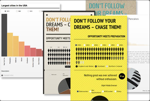
There's been a recent flurry of new offerings in the world of on-line tools for creating and publishing infographics, so I thought I'd provide a brief overview of the main protagonists. Some are new (still in beta), others are more established (have been around for a couple of years). The tools all follow a similar format: they provide a set of templates to which you add your content, and then publish the result. Easy.

Visual.ly
Visual.ly has been around for a while and is probably best known as a clearinghouse for infographics - a YouTube for infographics if you like. Visual.ly recently added the ability to create infographics. Currently, it offers only a handful of templates based on social media (Facebook and Twitter) themes. In order to use these you must sign-in to your Facebook or Twitter account and allow access to the Visual.ly app. An example infographic created from one of these templates is shown below.

At this stage Visual.ly's offering is quite limited but more "cutomizable infographics in popular categories, like sports, politics and food" are promised soon.

I think Visual.ly's most valuable resource is its blog. Making it easy to create infographics is only one piece of the puzzle. It's important to be able to create good infographics, especially if you want to stand out from the deluge of rubbish that's out there. Visual.ly's blog offers valuable advice on how to craft high-quality infographics.


Easel.ly
Easel.ly is a more recent entrant in the field of push-button infographics - it's still in beta. I've included Easel.ly's promotional video below, which provides a quick introduction to how it works.


Easel.ly describes itself as "a theme-based web-app for creating infographics and data visualizations." Like Visual.ly it provides a selection of templates. The choice is broader than that offered by Visual.ly - 15 templates are currently available - and you don't have to connect your Facebook or Twitter account. You can also start with a blank canvas.

You can then drag-and-drop "objects" (icons from a variety of categories), "shapes" (arrows, symbols, etc.) and text boxes onto your template. These can be customised (colour and size) once in place. You can also upload your own images for inclusion in your infographic.

Once your infographic is complete it can be published via Easel.ly for embedding in other Web pages.

Infogr.am


Infogr.am is another new kid on the infographics block. It is quite similar to the others in that it's template-based. There are two types of template to choose from:
  • infographics: of which there are eight templates
  • charts: bar chart, pie chart, line chart, glyph matrix and frog chart (yes, really)
Each of the infographics templates includes one or more charts. One nice feature is that in customising a chart you provide the actual data for the chart to visualize. This is presented via a spreadsheet GUI. As well as charts you can add accompanying text (title, quotes, free text) and insert your own images.

Once you've completed an infographic you can publish it via Twitter, Facebook or Pinterest, or embed it in other Web pages.

Venngage


Venngage is the latest offering from the creators of Visualize.me. It is perhaps the most complete on-line infographic tool of those considered here. So much so, that Venngage costs money ($99 per month for individuals; $249 per month for teams).

As with the other tools, Venngage is template-based; you can also start with a blank canvas. Venngage's infographics editor is a point-and-click affair. A large selection of charts is available. Each is backed by data you provide by either uploading it or entering it via a speadsheet UI. Shapes, text and images can also be added.

Number Picture


Number Picture has been around the longest of the services considered here - I've blogged about it before. The infographics templates that Number Picture provides are fairly simple having only a title, "blurb" (text block) and "picture" (chart). To create an infographic you supply the text and data. The latter is rendered as a picture.

Number Picture's emphasis is different from the others' in that it encourages users to create and share templates. The templates are created using Processing.js. Working with Processing.js is fairly easy for those of us from coding backgrounds but for non-coding folks this might be a problem, especially, if the existing templates don't provide what's needed.


Conclusion
Most of the tools I've discussed are fairly basic but have enough functionality to allow you to create a simple infographic. Venngage is the most complete offering but whether it's worth the money they're asking remains to be seen. All the tools make it easy to create infographics. However, creating good infographics is a different story.

There are many other on-line tools for creating data visualizations - too many for a single post - so here I've focussed on infographics tools. If I've missed any (or you have anything to contribute) then please leave a comment.

May 30, 2012

D3.js Transitions: Zoom, Zoom

Earlier this year I created a lap chart visualization using D3.js.  At the time I mentioned that it could be improved by adding the ability to "zoom" in on laps that feature a lot of overtaking.  I've implemented this feature using D3.js transitions.  You can try the interactive version (modern browser required) or refer to the image below.


When you click on a lap the chart expands the lap and those either side of it, making it easier to see what occurred during the lap.  All other laps are compressed to accommodate the additional space taken up by the expanded laps.  A second click collapses the expanded laps.

Transitions between expanded and collapsed states are animated using D3.js transitions.  Transitions are easy to implement; all that's needed is to select the elements that change during the transition, and the attributes and styles that are changed.  For example, here's the code that transitions the marker circles in the chart:

vis.selectAll('circle.marker') 
    .transition() 
    .duration(TRANSITION_DURATION) 
    .attr('cx', function(d) { 
        return SCALES.x(xform(d.lap, lap)); 
    });

The first line selects the circular markers, then a transition is defined (with one second duration) that is applied to the x-coordinate of each circle's centre.  Similar transitions are defined for the other elements that are transformed during a transition (position traces, lap tick-lines, lap labels, marker labels, etc.)

The xform() function is responsible for transforming x-coordinates when expanding a given lap.  It's not particularly interesting - refer to the code if you're really keen.

That's really all there is to implementing a transition.  The transitions API supports controlling other aspects of the transition such as delays and easing functions but the defaults were sufficient for my purposes.

Transitions automatically handle interpolation between several data types such as numbers and colours (RGB values or CSS names).  You can also implement custom interpolators for other data types.

The only awkward part of the implementation was listening for mouse clicks.  I needed to capture clicks anywhere in the chart to trigger a transition.  Ordinarily, a transparent svg:rect in the foreground of the chart could have been added to capture clicks.  However, the chart already had listeners for mouseover and mouseout to implement highlighting of drivers' lap placings.  A foreground rectangle would block the mouseover/mouseout events from reaching the elements that were listening for them.  Ultimately, I added all clickable elements to a CSS class "zoom", selected these using d3.selectAll and added a click listener to them.

The transitions API is a simple but powerful way of animating charts.  Consider using it next time you build a chart that provides multiple views.

The visualization is shared using a Creative Commons license, and the source-code is available on GitHub.

April 6, 2012

When is Easter Sunday?

With the approach of Easter I began thinking about the arcane method for calculating the date of Easter Sunday, which I think equates to the Sunday following the first full moon on or after March 21.  What does this lead to in terms of the distribution of dates on which Easter Sunday falls?

I plotted a histogram of the Easter Sunday dates for the years 325AD to 3000AD.  The chart is shown below and the interactive version (modern browser required) allows you to determine the date for a specific year.

Histogram of Easter Sunday dates 325AD - 3000AD

The dates range from 325AD as this was the year the First Council of Nicaea fixed the date of Easter Sunday.  The distribution of dates is not evenly distributed nor is it unimodal as one might expect.  The multiple peaks must follow from the distribution of dates of the full moon.

The visualization is shared using a Creative Commons license, and the source-code is available on GitHub.  I used the method given here for calculating the date of Easter Sunday.

March 29, 2012

Bible Visualization

Last year I compiled a collection of interesting visualizations of narrative text.  In searching for such visualizations I happened across many that focused on the Bible - enough for a separate blog post; this one.

BibleViz
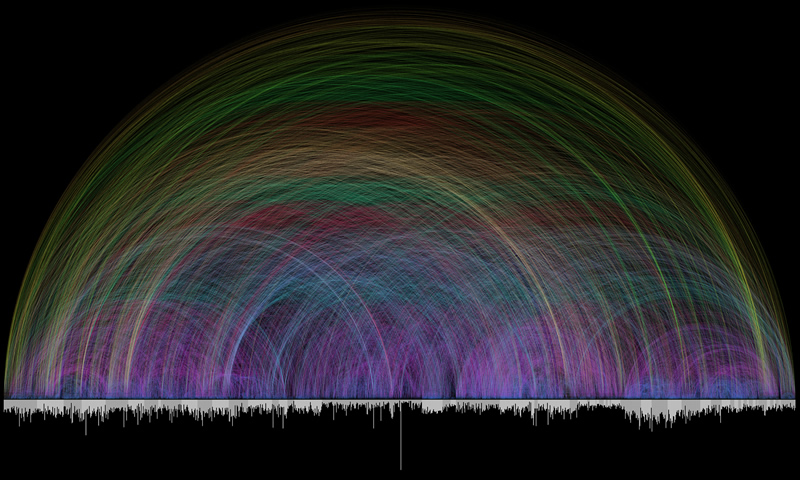
Chris Harrison has produced a set of three Bible visualizations.  The first is an arc diagram that visualizes cross-references between books of the Bible.  The bar chart at the base of the diagram represents the number of verses in each book.  The arcs represent cross-references between books with arc height and colour encoding the distance between the pairs of books connected by the arcs.

Arc diagram visualizing cross-references between books of the Bible

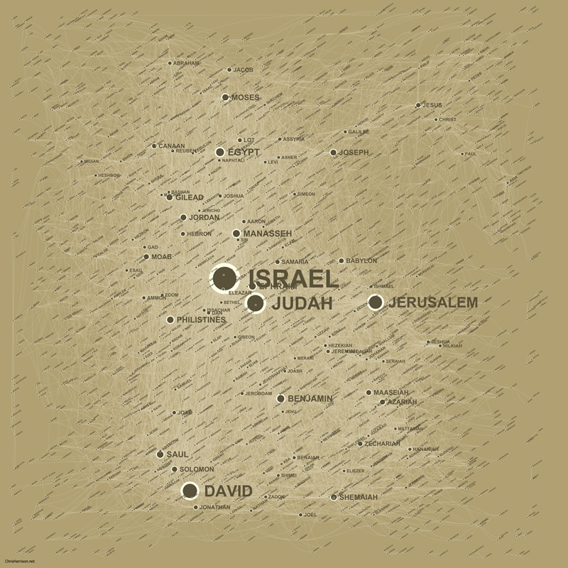
Chris also visualized the "social network" of people and places mentioned in the Bible.  A graph was formed with people and places as nodes, and edges between pairs of nodes (people/places) mentioned in the same verse.  A clustering algorithm was used to layout the nodes.  Labels are scaled according to the number of connections they have.

Social network of people and places mentioned in the Bible

Chris also visualized where in the Bible each person or place is mentioned.  The full text of the bible is overlaid with labels for each person or place name.  Lines connect each name label to the positions in the text where the name is mentioned.  The labels are scaled according to the number of mentions, and positioned at the average point of their mentions.

Distribution of references to
people and places in the Bible


OpenBible
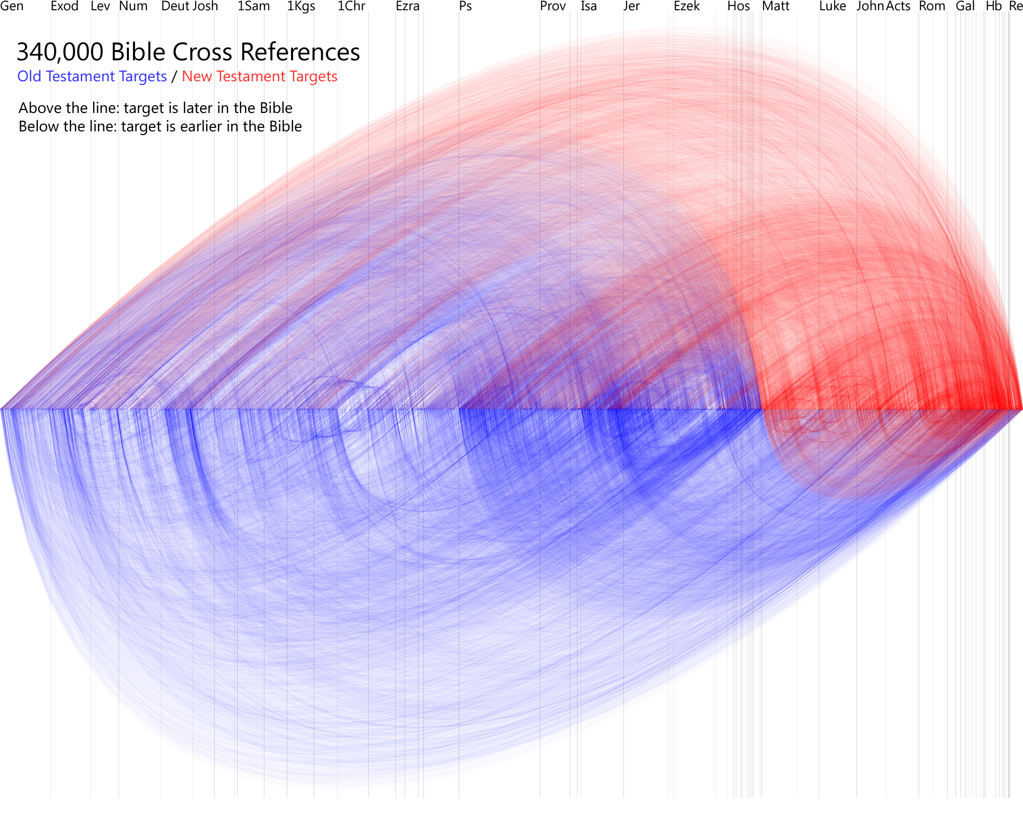
Inspired by Chris Harrison's work, OpenBible has also produced a similar arc diagram visualizing cross-references between books of the Bible.

Arc diagram visualization of biblical cross-references

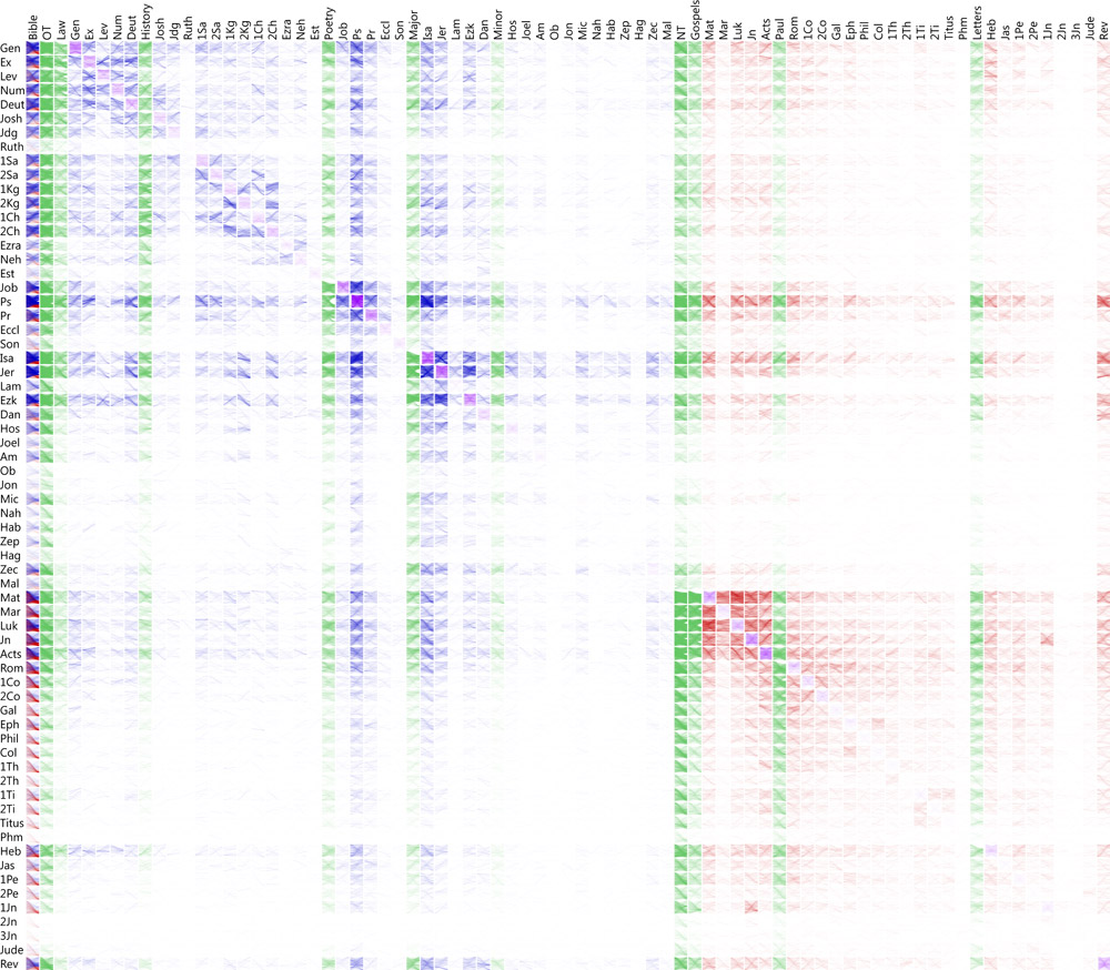
OpenBible also provides an interactive tool for visualizing biblical cross-references.  At the highest-level the cross-references are visualized using a matrix.

A matrix visualization of cross-references between books of the Bible

You can click on the matrix to drill-down to a verse-by-verse visualization of the cross-references between a pair of books.

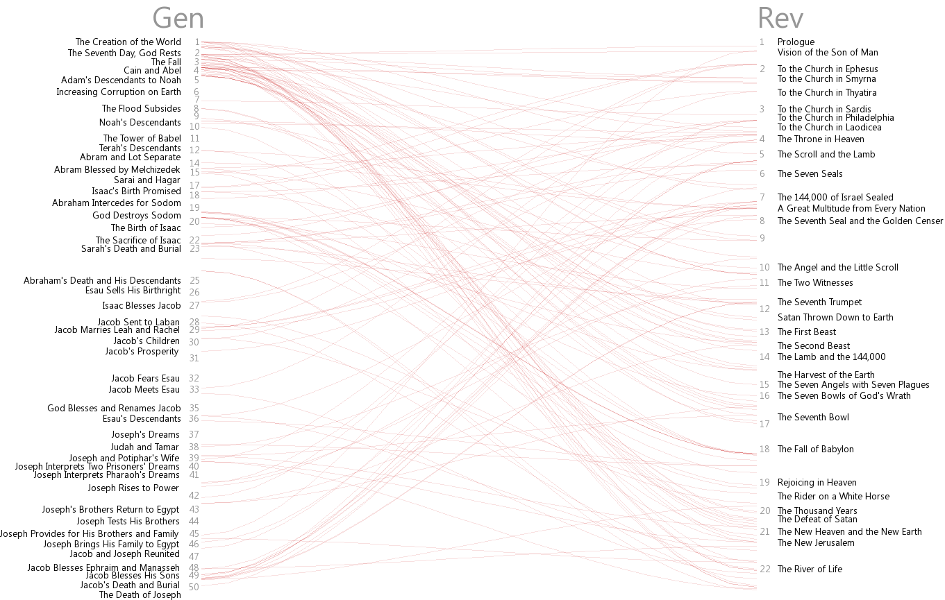
Visualisation of the cross-references between Genesis and Revelations

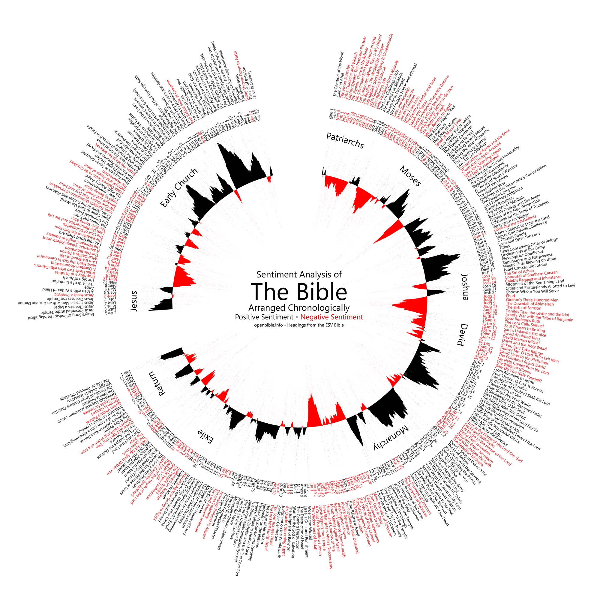
OpenBible also has two visualizations of the "ups and downs" in the Bible.  Sentiment analysis was used to determine the mood (positive or negative) of each verse.  These sentiment scores were then smoothed (150-verse moving average) to provide a more coherent result, and then plotted radially with red and black depicting negative (down) and positive (up) sentiment, respectively.

Sentiment analysis of the Bible.

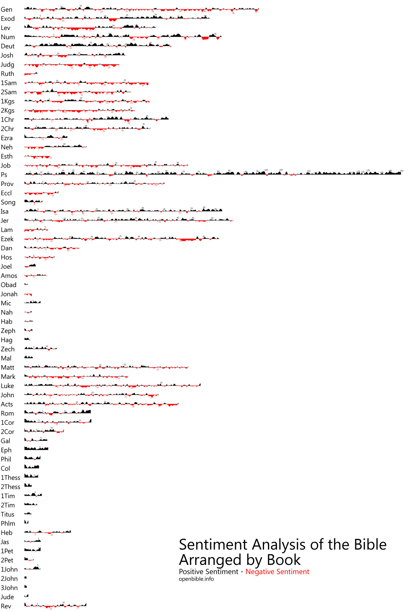
The same analysis has been applied with less smoothing (5-verse moving average) and laid out vertically as a set of sparklines to show the changing mood within each book.

Sentiment analysis of each book of the Bible.

Gospel Spectrum
Ahn Dang produced a visualization of the narrative of Jesus' life as described in the Gospels of Matthew, Mark, Luke and John.  A simple bar chart is used to plot the narrative with a bar for each event in the story of Jesus' life.  Bar length and brightness denote the number of verses and gospels, respectively, describing each event.  For example, the long bright blue bar to the right indicates that 56 verses describe "Peter's denial", and is mentioned in all four gospels.

Gospel Spectrum for all four gospels combined.
As well as the combined view, the gospels can be visualized individually, using a distinct colour for each.

Gospel Spectrum showing each gospel with a distinct colour

Similar Diversity
Designers Philipp Steinweber and Andreas Koller produced an infographic focused on not just the Bible but also the holy books of four other religions: Buddhism, Hinduism, Islam and Judaism.  Their visualization was derived from text analysis in order to avoid bias on the part of the designers.  As the project's title suggests the visualizations are meant to show the similarities and differences between the holy texts.

The graphic comprises several different data visualizations.  The arc diagram shown below visualizes the 41 most frequent characters (arranged alphabetically).  Names (and arcs) are scaled according to frequency with which characters are mentioned; the coloured arc above each name shows the relative frequency for each holy book, e.g. Allah appears only in the Qur'an.

Below each character is a bar chart that visualizes each character's "activities" (determined from adjacent verbs in the text).  These are coloured according to their relative frequency in each holy book and, scaled (height) by total number of occurrences.  The activity vectors are used to calculate similarity between pairs of characters.  This similarity is visualized by the grey arcs connecting characters.  The weight and thickness of the arcs encodes the similarity coefficient.

Arc diagram of leading characters


Bible vs. Qur'an
Pitch Interactive focused on comparing the Bible with the Qur'an on the basis of word frequency.  Enter a keyword and verses containing it are highlighted in the Old & New Testaments of the Bible and in the Qur'an.  You can opt for exact matches and the inclusion of synonyms.

Word frequency visualization for the Bible and the Qur'an

Exegesis
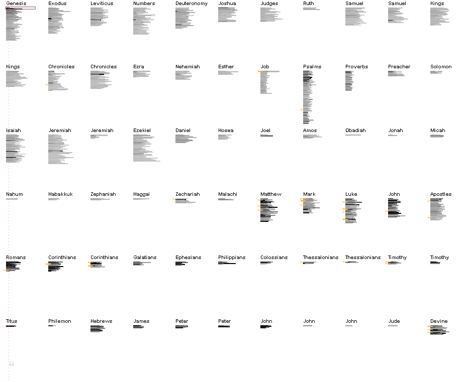
Kushal Dave used Google to count the number of times each verse in the Bible is quoted on the Web.  He then created Exegesis to visualize these counts.  Each verse is represented by a bar.  Darker bars represent verses that are quoted more often.  The visualization allows you to search for particular phrases and words.  The image below shows the visualization with verses highlighted if they contain the word "Satan".


Exegesis visualization with verses containing "Satan" highlighted.


Many Eyes
There are many Bible visualizations on IBM's Many Eyes.  One of Many Eyes' unique visualizations is the Phrase Net, which I've used below to visualize usage of the phrase "x begat y", that is, the "patriarchy" in the Old Testament (click on the visualization to interact with it - requires Java).


If you're aware of any other visaulizations of the Bible or other holy books then please leave a comment below.

March 8, 2012

D3 Lap Charts

A while ago I blogged about lap charts; I compared the static charts used by the FIA to visualize Formula 1 Grand Prix races, with an interactive "stack flow" created using Impure to visualize rankings of the world's most populous cities.  I concluded that the stack flow's interactivity improved the ability to make sense of such charts.

To put this to the test I've created an interactive lap-chart using D3.js.  It visualizes the Australian 2010 Formula 1 Grand Prix.  The interactive version allows you to highlight a driver's race by positioning your mouse cursor over his name or lap trace.  If you don't have a modern browser (Firefox, Chrome, Opera, Safari or IE + Chrome Frame) then you can refer to the images shown below.

Australian 2010 Formula 1 Grand Prix Lap Chart implemented in D3.js
Highlighting Felipe Massa's race


It's much easier to make sense of the interactive lap chart compared with the static chart used by the FIA.  However, there's still room for improvement.  Around laps 8, 9 and 10 most of the drivers make a pit stop.  This results in many brief but significant changes in race position.  Even with interaction it's a bit messy.  This could be improved by adding interactive zooming, e.g. click on a lap and it (and neighbouring laps) will expand horizontally making it easier to see the rapid changes that occur over the space of a few laps.  Something for version 2.0 perhaps.

The visualization is shared using a Creative Commons license, and the source-code is available on GitHub.  You can use the visualization with your own race data.  Simply place it in a JSON object file and refer to it from the code.

The JSON object is an associative array with values for
  • lapCount: the total number of race laps
  • laps: the lap data for each driver, which is an associative array with values for
    • name: driver's name
    • placings: placing at the end of each lap completed (first value is grid position)
    • accident: lap(s) on which an accident occurred
    • pitstops: lap(s) on which the driver pitted
    • mechanical: lap(s) on which mechanical failure occurred
  • lapped: the race positions that were lapped by the lead driver (-1 indicates none)
  • safety: the laps on which the safety car was deployed

January 27, 2012

More Last.fm Data Visualizations

This article follows up another I wrote in 2011 about visualizations of Last.fm listening histories.  I ended that article with a comment on the many other types of visualizations of Last.fm data.  These visualizations are made possible by the Last.fm API, which supports a broad range of queries about many aspects of Last.fm data.

Here I look at some of the other types of visualization designers have created using Last.fm data.

Artist Similarity
Last.fm provides a similarity index between pairs of artists.  Tamás Napusz
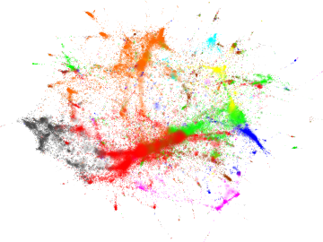
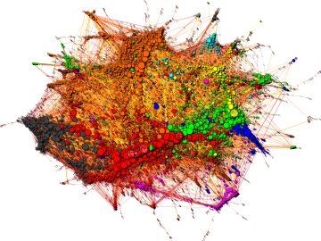
used this data to construct the graphs shown below.  Each node in the graph is an artist (coloured by musical genre) with edges connecting artists with high similarity indices.  Force-directed layout is used, so clusters form representing the various musical genres.  More details about the graphs are available here.


Social Network
Last.fm users can become friends with other Last.fm members, forming a social network.  Connections are usually made on the basis of shared musical taste but this need not be the case.  The social network can be queried via the Last.fm API.

Last.forward visualizes the Last.fm social network using either a tree view or radial graph, as shown below.  Nodes (users) in the graph can be selected to obtain user details and statistics.  Last.forward is written in Java and is open source; the source code is available at SourceForge.


Tags
Last.fm allows users to tag artists.  As usual this tag data is available via the Last.fm API.  Over at NEXTVIS they've created a visualization based on comparing two artists' tags.  Tags are represented by circles (horizontally) positioned according to the relative strength of their association with each artist but it's not clear how they are positioned vertically.  Nor is the size of a tag's circle made clear (number of times tagged?)  A couple of examples are shown below.


If you come across any other interesting visualizations of Last.fm data then please leave me a comment.