December 11, 2014

Cartograms of the Periodic Table of Elements

I recently came across a couple of examples of cartograms of Mendeleev's periodic table of elements. Before sharing them let's travel back in time to the 1970s to see WF Sheehan's cartogram (shown below), which inspired these more recent works.
The Elements According to Relative Abundance

Sheehan mapped the relative abundance of elements in the earth's crust to the area assigned to each element in the table. As Sheehan said: The chart emphasises that in real life a chemist will probably meet, O, Si, Al, ... and that he better do something about it.

More recently, the Big Picture team at Google Research produced an interactive version of Sheehan's cartogram. In the Google version you can choose between several choices of mapping variable:
  • mentions in books
  • abundance in the human body
  • abundance in the earth's crust
  • abundance in the sea
  • abundance in the sun
  • volume
  • volume (excluding gases)
Below, for example, is the cartogram for relative abundance in the earth's crust.


Additionally, you can choose to represent the mapping variable in several ways:
  • bars
  • cubes (as shown above)
  • electron rings (not a mapping variable; shown below)
The on-line version is interactive so you can experiment with the settings. Mouse-over an element in the table to display a tool-tip with additional information about the element.

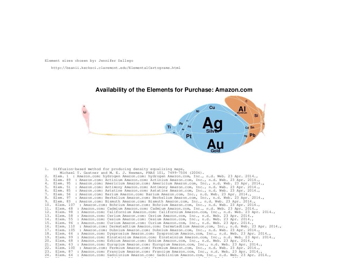
Along similar lines is the Elemental Cartograms tool developed by Babak Sanii, that allows you to specify your own table of elemental data, and will generate a cartogram accordingly. Below, for example, is the availability of elements for purchase on Amazon. You can find many more weird and wonderful examples on the Elemental Cartograms Tumblr feed.

November 26, 2014

Stacey Barr: The First Three Steps To Get KPI Buy-In

Last week I attended a webinar by Stacey Barr to launch her new book Practical Performance Measurement, which describes Stacey's PuMP Blueprint for developing performance measurement processes.

The webinar covered the preparatory steps in performing meaningful performance measurement, including
  1. Why performance measurement is difficult
  2. What's wrong with current wisdom about KPIs
  3. What actually works
The webinar also provided a brief overview of the PuMP Blueprint.

If performance measurement is an important part of your work or that of your organisation then you can find out more here.

November 24, 2014

Stephen King Screen Adaptations (Plotly)

Stephen King is a prolific author, whose books I've enjoyed reading since I was a teenager. His prodigious written output has spawned many screen adaptations for film and television, but in many cases I've been disappointed by the screen versions; see, for example, the dreadful "Under the Dome" TV mini-series.

I decided to look at how well-received King's films have been compared with his books. I found a list of screen adaptations, and for each looked up the book's rating on Goodreads and the movie's rating on IMDb. I necessarily omitted screenplays, movie sequels (not a adapted from a King book) and short stories that contributed to only a portion of a movie. I then imported this data into Plotly and produced the chart shown below
Mouse over a glyph to display details.

The chart reveals a positive correlation between the ratings of King's books and their screen adaptations. Highly rated novels such as "The Green Mile", "Rita Hayworth & The Shawshank Redemption" and "The Body" produced well-regarded movies, whereas poorly rated stories such as "Trucks", "The Mangler" and "Tommyknockers" resulted in absolute stinkers on screen.

We can also see that TV adaptations (wide glyphs) were generally less well-received than were film adaptations (tall glyphs). So too short stories (orange glyphs) and their screen adaptations tend not to rate as highly as novels (blue glyphs) and novellas (green glyphs), and their screen adaptations.

Incidentally, this was my first time using Plotly. I was able to import my data and generate a scatter plot with relative ease. Customising it for my needs took a little longer as I was new to the tool. I'll definitely use Plotly again.

November 11, 2014

Visualizing how my personal tax was spent

I received my tax assessment yesterday. On the last page was the bar chart shown below, which visualizes where my "personal tax was spent, based on 2014-15 Budget estimates" (according to the caption). To the right of each bar is a dollar amount (obscured) that represents the portion of my taxes spent in each category.

Where my "personal tax was spent, based on 2014-15 Budget estimates".


I've not seen this chart on previous years' tax assessments. It provides a useful indication of where the Federal government (expects) to spend our personal taxes.

The chart is simple but effective. Sorting from largest to smallest is a good choice, as is the breakdown of the Welfare budget into sub-categories. I don't believe the colours encode any information. I'm glad they didn't use a (3D) pie chart which so often blights public reports of budget expenditure.

I'll be interested to see what charts accompany my tax assessment next year. I'd be interested to see some historical information such as budgeted versus actual expenditure, or the change in amount of tax paid.

September 4, 2014

The Simpsons Social Network (Season 1)

I've been a fan of The Simpsons ever since Season #1 was first broadcast. So, I was recently thinking about visualizing the social network (no, not this one) of Simpsons characters.

Constructing the network of social relationships between various Simpsons characters would be a difficult and time-consuming process (does Lisa even have any friends?) So, I opted for a different network that can be constructed programmatically; the network of character co-appearances. In this network, two characters are connected if they appear in the same episode of The Simpsons. This network is similar to the one constructed for film actors that allows us to determine six degrees of Kevin Bacon.

The Simpsons co-appearances network can be constructed by parsing the episodes pages of Wikisimpsons. Mathematically speaking, the network is a graph. Each node of the graph represents a Simpsons character. An (undirected) edge connects each pair of nodes whose characters appear in the same episode. To each edge I add a weight; the number of episodes in which the pair of characters co-appear. I also label each node with the number of episodes in which its character appears.

Having constructed the graph we can set about visualizing it. Visualizing graphs helps you understand the structure of a network. So the choice of graph-layout algorithm is critical. If you impose a hierarchical layout, you'll see hierarchies. If you impose a circular layout you'll see circles.

For this reason I've used a force-directed layout, which attempts to position the nodes such that the distance between any pair of connected nodes is inversely proportional to the weight on the edge between them. This results in characters who co-appear often having their nodes positioned close together, while those that don't will have their nodes separated.

To do this I used Gephi the "open source graph visualization platform". Gephi allows you to experiment with various layout algorithms and customize the appearance of your graph. You can easily apply different colour maps, labelling and rendering attributes to your graph's nodes and edges. Gephi has tools for filtering nodes and edges, and an arsenal of graph theoretic indices can be calculated.

I constructed a co-appearances graph for Season 1 of the Simpsons and loaded it into Gephi. I applied the following settings:
  • Layout: ForceAtlas 2
  • Node size and colour: number of episodes in which a character makes an appearance
  • Edge colour: number of episodes in which characters connected by the edge co-appearance
The resulting graph is shown below. High-resolution renderings are also available (PNG, PDF, SVG).
Graph of Simpsons characters co-appearances in Season 1.

The graph shows us several things. The "central" characters - Homer, Marge, Bart, Lisa and Maggie Simpson - form a cluster at the centre of the graph. They have the largest, darkest nodes because they appear in every episode of Season 1.

Around this central cluster are positioned smaller, lighter nodes for characters who appear frequently but not in every episode; characters like Milhouse Van Houten, Moe Szyslac, Barney Gumble, Monty Burns and Waylon Smithers. Notice that Burns and Smithers, and Moe and Barney are positioned close together as they often appear in the same episodes.
The central cluster of the Simpsons co-appearance graph.

On the outer edges of the graph are clusters of characters who appear together in a single episode. Below we see the cluster (of minor characters) for episode 7 "The Call of the Simpsons". Between these episode clusters are positioned characters who appear in two or three episodes.
Cluster of minor characters appearing in episode 7 "The Call of the Simpsons".
If you'd like to experiment with this graph you can download it from Github.

June 19, 2014

Australian Federal Budget 2014/15: Changes to Public Service Staffing Levels Visualized Using a D3.js Zoomable Treemap


A friend recently drew my attention to Ausviz, a site focussed on visualizations of Australian data, particularly data sets from data.gov.au. One of the first Ausviz visualizations I looked at uses a force-directed graph to visualize changes in public service staffing levels arising from the 2014/15 Federal Budget. The graph represents the hierarchy of ministries and departments, with the size and colour of leaf nodes encoding the change in departmental headcounts.

An alternative way of visualizing hierarchies is to use a treemap. The hierarchy is represented by a nested layout of rectangles. The size and colour of the rectangles is used to encode dimensions of the data.

So, taking inspiration from the Ausviz visualization I implemented a treemap to visualize the same data. The layout of rectangles represents the hierarchy of Federal Government ministries and departments. Rectangle sizes encode the numbers of staff in each department (2013/14 or 2014/15). Rectangle colours encode the changes in staffing levels (absolute or relative). The colour scale ranges from red (staff decrease) through white (no change) to green (staff increase).

The treemap is shown below. An interactive version can be found here (fullscreen). You will need a "modern" browser to use the interactive version, which supports the following operations:
  • change the size encoding (2013/14 or 2014/15)
  • change the colour encoding (absolute or relative)
  • drill down into a ministry (click on a rectangle)
  • mouse over a rectangle to display a departmental tool-tip


The treemap allows us to quickly see where the biggest changes, both absolute and relative, are to occur:
  • Size: 2013/14; Change: absolute (we see the big winners and losers)
    • Gain: Dept. Foreign Affairs & Trade - 1659, 42%
    • Gain: Dept. Prime Minister & Cabinet - 1543, 200%
    • Gain: Dept. Defence - 604, 1%
    • Loss: Dept. Employment, Education & Workplace Relations - 3740, 100%
    • Loss: Australian Taxation Office - 2954, 13%
  • Size: 2014/15; Change: absolute (we see the new, large departments and agencies)
    • New: Dept. Employment - 1716
    • New: Dept. Education - 1823
    • New: National Disability Insurance Agency - 798
  • Size: 2013/14; Change: relative (we see shut down departments and agencies)
    • Gone: AusAID - 1982
    • Gone: Dept. Resources, Energy & Tourism - 655
    • Gone: Dept. Regional Australia, Local Govt. Arts & Sports - 482
    • Gone: Health Workforce Australia - 140
    • Gone: Clean Energy Finance Corp. - 50
    • Gone: Wine Australia Corp. - 49
    • Gone: Australian National Preventative Health Agency - 40
    • Gone: Climate Change Authority - 35
    • Gone: Telecommunications Universal Service Management Agency - 17
    • Gone: Grape & Wine R&D Corp. - 11
    • Gone: Sugar Development R&D Corp. - 8
  • Size: 2014/15; Change: relative (we see the new, small departments and agencies)
    • New: Australian Grape & Wine Authority - 55
There are better ways of visualizing changes of this kind, e.g. a bump chart, sortable table, but the advantage of using a treemap is that it shows the structure of the public service.

The treemap was implemented using D3.js, and borrowed heavily from a couple of excellent examples:
Source data comes from Budget Paper 4 Table 2.2 Average Staffing Table. Note the many footnotes associated with this data.

The source-code is available on Github and licensed under a Creative Commons Attribution 4.0 International License.

March 28, 2014

A Distorted and Incomplete Picture

When I saw Ben Goldacre's latest book Bad Pharma: How Drug Companies Mislead Doctors and Harm Patients on the new releases bookshelf of my local library, I borrowed it immediately. Not because I thought it would inform my data visualization work but because I really enjoyed Ben's previous book Bad Science.

So, I was pleased when I read Bad Pharma to find that it focuses on data, the raw material we work with when creating visualizations. I was also deeply disturbed by the book given that it details how modern evidence-based medicine is broken. Ben provides a useful summary of Bad Pharma in the book's introduction:
Drugs are tested by the people who manufacture them, in poorly designed trials, on hopelessly small numbers of weird, unrepresentative patients, and analysed using techniques which are flawed by design, in such a way that they exaggerate the benefits of treatments. Unsurprisingly, these trials tend to produce results that favour the manufacturer. When trials throw up results that companies don't like, they are perfectly entitled to hide them from doctors and patients, so we only ever see a distorted picture of any drug's true effects. Regulators see most of the trial data, but only from early on in a drug's life, and even then they don't give this data to doctors or patients, or even to other parts of government. This distorted evidence is then communicated and applied in a distorted fashion. In their forty years of practice after leaving medical school, doctors hear about what works through ad hoc oral traditions, from sales reps, colleagues or journals. But those colleagues can be in the pay of drug companies – often undisclosed – and the journals are too. And so are the patient groups. And finally, academic papers, which everyone thinks of as objective, are often covertly planned and written by people who work directly for the companies, without disclosure. Sometimes whole academic journals are even owned outright by one drug company. Aside from all this, for several of the most important and enduring problems in medicine, we have no idea what the best treatment is, because it's not in anyone's financial interest to conduct any trials at all. These are ongoing problems, and although people have claimed to fix many of them, for the most part they have failed; so all these problems persist, but worse than ever, because now people can pretend that everything is fine after all.
But enough about medicine. What makes Bad Pharma interesting to a data visualization practitioner are not charts and graphs (there are only a few in the book) it's the discussion of data. The book's first chapter Missing Data describes how drug trials performed by pharmaceutical companies overwhelmingly produce results that are favourable to the companies. Goldacre argues that this arises for several reasons
  • flawed experimental design: trials are designed in ways likely to produce a favourable outcome
  • flawed data analysis: see my post on Alex Reinhart's Statistics Done Wrong
  • publication bias: trials that produce unfavourable outcomes are simply not published, skewing published data towards favourable results
This reminds us to be circumspect about the data we visualize. We should ask:
  • How was the data collected?
  • How has the data been transformed or processed?
  • Is the data complete?
The answers to these questions are metadata that we need to communicate as part of any visualization we create. Without it, we risk painting a distorted and incomplete picture of the data we are visualizing.

March 21, 2014

Lyra: the Interactive Visualization Design Environment

I recently spent some time using Lyra an "interactive visualization design environment" that allows you to create visualizations without writing a single line of code. It's being developed by Arvind Satyanarayan, Kanit “Ham” Wongsuphasawat and Jeffrey Heer (think Prefuse, Protovis, D3, Vega) at the University of Washington's Interactive Data Lab.

Lyra is a bit like other interactive visualization design tools such as Tableau and Spotfire. However, under the hood it's powered by D3 (like Plot.ly). Now, I enjoy coding visualizations directly using D3 but I realise not everyone shares my enthusiasm or has the time to learn D3. Lyra gives you access to the expressiveness of D3 without requiring you to learn its API (or Javascript).

The Lyra application is shown below and consists of three panels:
  • the left-hand panel manages Data Pipelines, where you define and transform (sort, group, filter, window, apply formula) data sources
  • the centre panel displays your visualization, where you interactively select and modify visualization elements: marks (rectangles, symbols, arcs, areas, lines and text), axes and layers
  • the right-hand panel provides access to attributes of the elements in your visualization
Once you've created a visualization you can export it as an image (PNG or SVG) or a Vega specification.


If you're familiar with D3 then you'll recognise some of its idioms in Lyra. For example, D3's data-binding mechanism is implemented by dragging-and-dropping data variables onto the attributes of visual elements.

If you want to try Lyra then you have several options:
Bear in mind that Lyra is alphaware. I did encounter a few issues, e.g. saving and recovering work didn't appear to work properly. The authors are interested in constructive feedback.

February 20, 2014

Statistics Done Wrong - Alex Reinhart

I've just finished reading Alex Reinhart's excellent Statistics Done Wrong; a guided tour of common statistical fallacies and misconceptions. It covers p-values, statistical power, statistical significance, pseudo-replication and stopping rules.

Statistics Done Wrong is written with all scientists in mind, assuming no knowledge of statistical methods. It's essential reading for all data scientists, including data visualization practitioners. Even though we're not data analysts we need at least a basic level of statistical literacy.

The problems Alex describes are rife in the scientific peer-reviewed literature. By coincidence I'm reading Ben Goldacre's Bad Pharma, which focusses on how clinical trials data is distorted by the pharmaceutical industry. Many of the issues Alex raises are seen in practice in Bad Pharma.

Statistics Done Wrong concludes with What Can Be Done? Here I quote the Your Job section:
Your task can be expressed in four simple steps:
  1. Read a statistics textbook or take a good statistics course. Practice.
  2. Plan your data analyses carefully and deliberately, avoiding the misconceptions and errors you have learned.
  3. When you find common errors in the scientific literature – such as a simple misinterpretation of p values – hit the perpetrator over the head with your statistics textbook. It’s therapeutic.
  4. Press for change in scientific education and publishing. It’s our research. Let’s not screw it up.

Statistics Done Wrong is on-line, free and should take you no more than an hour to read. Once you've read it share it with your data scientist colleagues. And if you want to learn more about data analysis then I recommend Coursera's Data Analysis MOOC - read my account of it here.

January 26, 2014

Review: Infoactive (beta)

Infoactive is an on-line tool for creating infographics, and is similar to Infogram, Easel.ly and Venngage - see my earlier review of these offerings.

Infoactive garnered considerable attention from the visualization community as a result of its highly successful Kickstarter campaign, which raised $55,109 (more that quadrupling its $12,000 target) from 1,448 backers. The promotional video clip is shown below.


I was one of those backers, which granted me early access to the Infoactive beta program.What follows are my impressions of the tool after a few hours experimenting with it.

At the outset, it's important to stress that at the time of writing Infoactive is in beta. I did encounter several problems that made working with the tool difficult. So, if you're expecting to start using Infoactive and be immediately productive then you're going to be somewhat disappointed.

With that out of the way let's focus on what you can do with Infoactive. The tool is very easy to use. A panel on the left-hand side of the page holds a palette of graphical elements that you can drag-and-drop onto your infographic canvas.

Two features that distinguish Infoactive from its rivals are
  • Connect to live data sources: you can provide the URL of a public Google Drive spreadsheet to serve as your data source. If the data changes then so too does the Infographic connected to it.
  • Infographics created with Infoactive are interactive: this includes filtering and details on mouse-over events.
Below is a sample infographic created using Infoactive. I would have preferred to include my own example but due to some of the bugs I encountered I'm including the example created by the Infoactive team:


Data

Two types of data source can be used: public Google Drive spreadsheets or CSV files uploaded to Infoactive. You can specify multiple data sources for each infographic, with each chart connected to a specific source. An editor is provided that allows you to modify cell values in each data source.

Charts

Several chart types are provided:
  • Line and area charts
  • Horizontal and vertical column charts
  • Pie and donut charts
  • Gauges
  • Maps
You can drag-and-drop charts into your infographic. Once in place, you can configure various attributes of the chart such as its title, data set and the data columns assigned to each axis.

Filters

Filters are a useful interactive element. When placed in an infographic they allow the user to focus on a subset of the data defined by a categorical data column. Charts associated with the filter are updated in response to the user's selections. You can configure the data source, data column and layout of each filter.

Other

A variety of text blocks (header, sub-header, text, logo) is provided. Two default colour themes (classic, earth) are available - you can also create a custom colour palette.

Publishing

Once you've created an infographic you can publish it. This provides you with a URL which displays the infographic on its own page (for sharing on social media), or an iframe for embedding in a web page.

Conclusion

It's early days for Infoactive. Many people have pledged support, so expectations are high. Similar tools are available but the live and interactive aspect of Infoactive infographics differentiate them from the others. Infoactive is a promising tool that is easy to use but work is needed to iron out the bugs.